People Are the Point
Whitney Bolster is a spark plug with a smile that lights up any room. She has a knack for seeing what’s coming next in the world and drawing people into a shared vision.
Matt Steel first worked with Whitney and her Atlanta-based agency, Ampersand, several years before Steel Brothers was born. We present this project from his perspective.
Whitney is a writer and teacher turned agency owner. We met in the early 2000s, and over the years we’ve built a friendship around our shared loves of creative freedom and thoughtful brand experiences.
In early 2016, Whit approached me to talk about her agency’s brand identity. At the time, Ampersand specialized in content creation – photography, video and messaging. Whit wanted to clarify her agency’s purpose and vision and branch out into branding and design. Though she had designers on her team, she felt my outside perspective was crucial. I was a sole practitioner, looking to deepen my branding process and try new methods. It was a perfect time to collaborate and experiment.
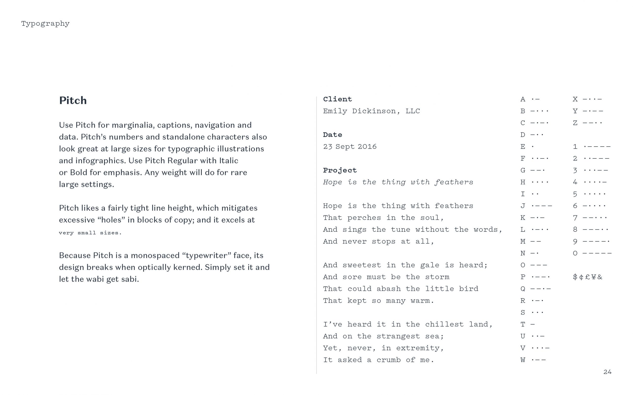
Scope Verbal Identity Visual Identity
Photo by Ren Adkins
As I listened to Whit describe how Ampersand is an extension of what matters most to her, two questions popped into my mind. If an authentic brand communicates like a real person, then why not use the best parts of Whit’s personality to steer her agency’s brand? And what if we use the Enneagram as our guide? Maybe it’ll unlock something beautiful. Maybe it’ll be a waste of time. At any rate, she’ll have new insights into what drives her and how she can grow.
I pitched the idea, and she loved it.
After she read about all nine types and took a test, we reconvened and Whit told me both the Enthusiast (Seven) and Challenger (Eight) types resonated with her. After further discussion, we both agreed the Seven’s curiosity, playful energy and optimism seemed like a closer match. So what would it look like if we apply the best qualities of this archetype to Ampersand?
Love Will Set Us Apart Again
It’s a September afternoon, and Ampersand’s brand identity is ready for reveal. This is the last presentation of my freelancing days, and I want to make it count. I ask her to queue up an album as we begin: Total, by Joy Division & New Order, starting from “Love Will Tear Us Apart” onward. The lyrics are reflective and raw but the music is hopeful – authentically human.
The concept of togetherness weaves throughout the program. The whole thing is very, deliberately, Enneagram Seven.
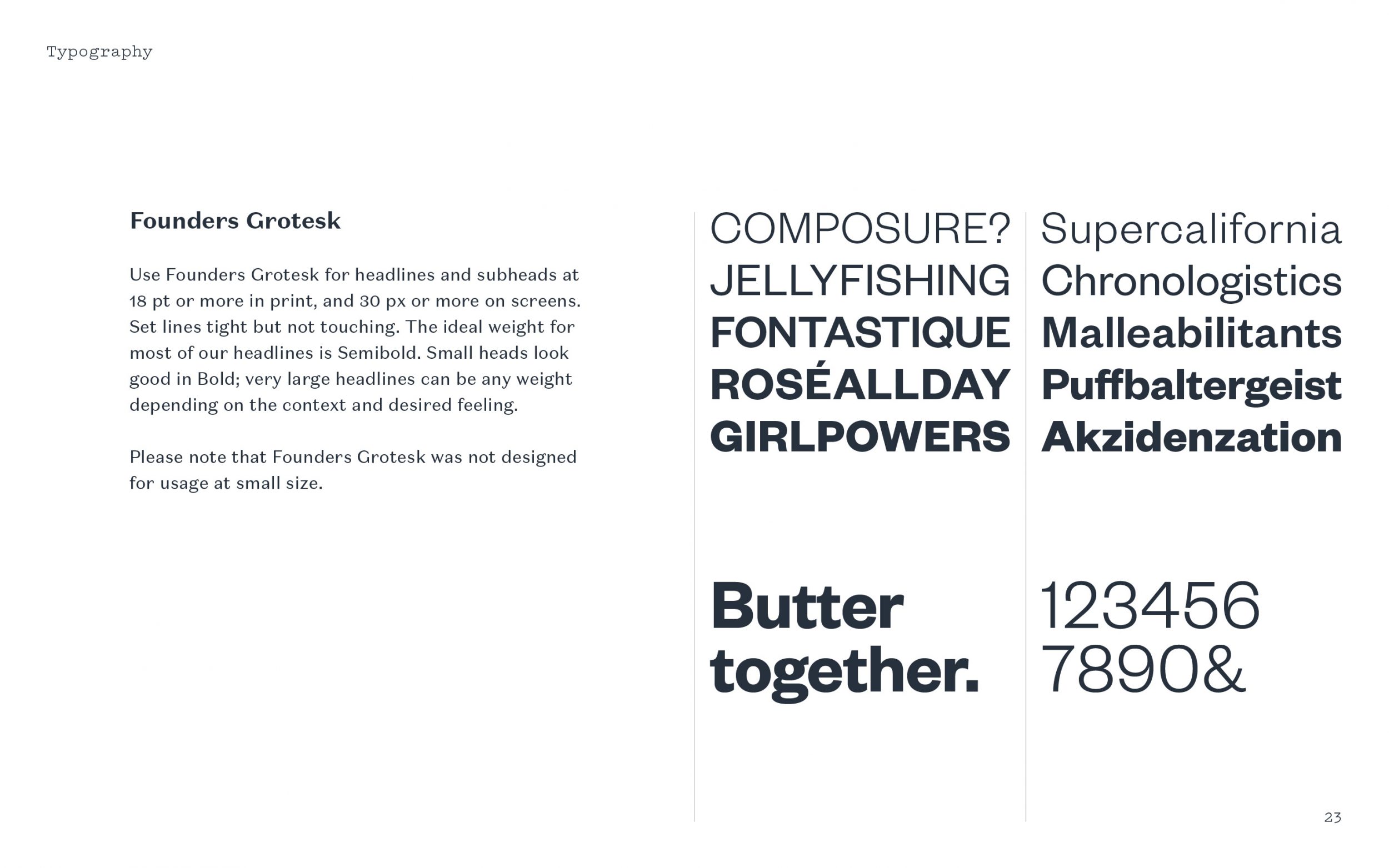
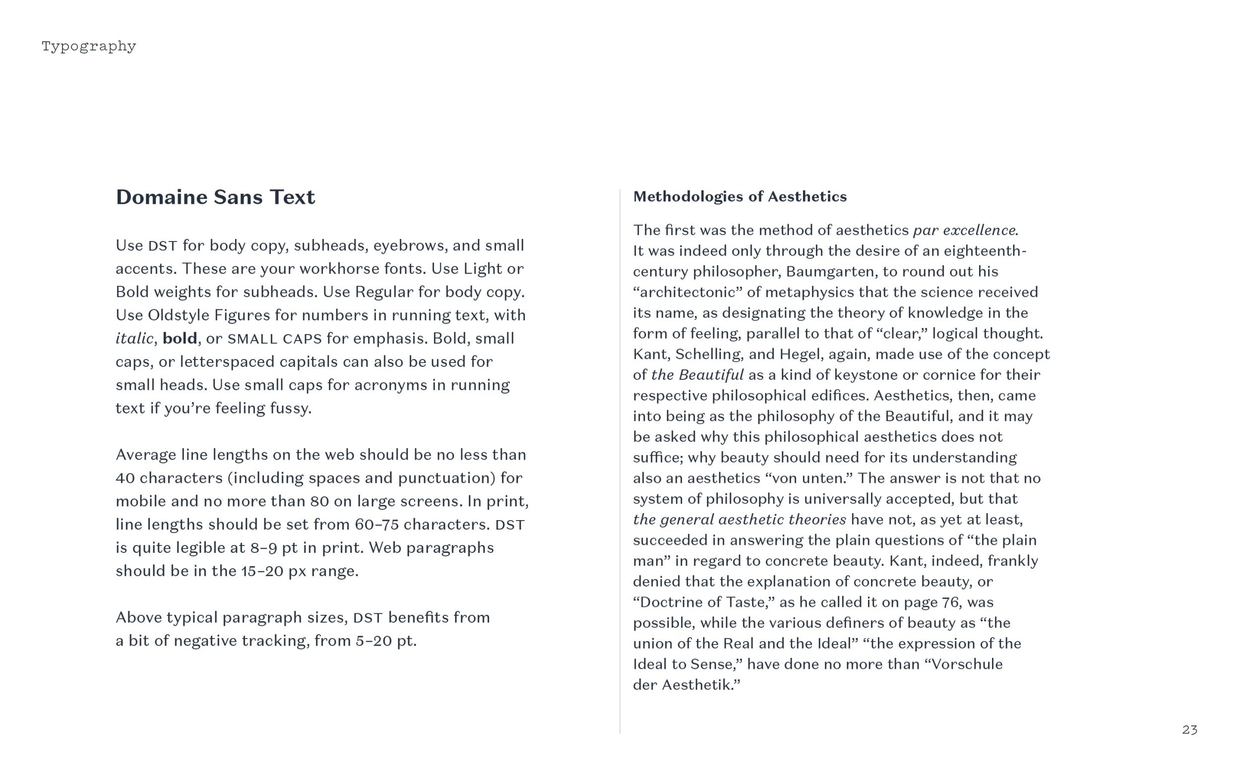
The logomark is an ambigram symbolizing strong bonds and flexible energy. The logotype leans into the future. The voice is joyfully assertive, the colors bright as a tropical garden. Typography is bold, curvy and peculiar.
Throughout the presentation, Whit laughs and exclaims. We reach the last slide and I ask what she thinks. She’s in tears. “You’ve given me myself. This is such an amazing gift! It’s all so clear and right – now I just need to get this brand out into the world.”
The goal of this project was simply to help set a new direction for Ampersand’s identity and give them the parts and pieces for launch. I made basic guidelines for color and typography, shipped the files and Whit’s team was off to the races.
New Niche, Same Spirit
Several months after I handed off the system to Ampersand, they shifted gears from general creative practice to a distinct niche: branding for companies built by and for women. This change required a different marketing strategy, along with a raft of new copy (written by Whit).
For me, it’s been a thrill to watch Ampersand grow and establish a reputation as the go-to creative shop for female founders. They’ve extended the system in ways I hadn’t imagined, tweaked a couple of colors and introduced a different headline font (which I actually prefer for them). But through it all, the core identity has remained intact.
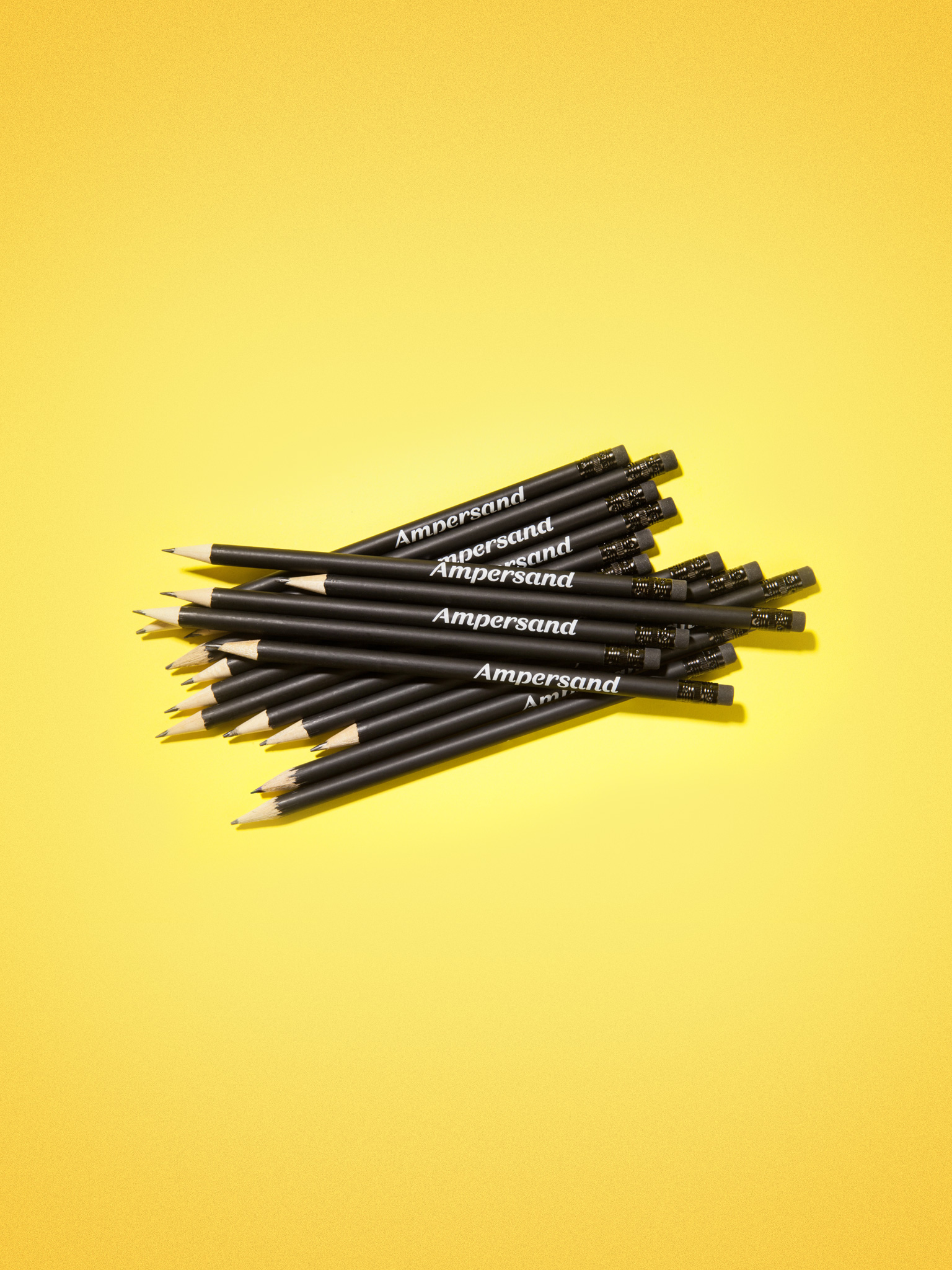
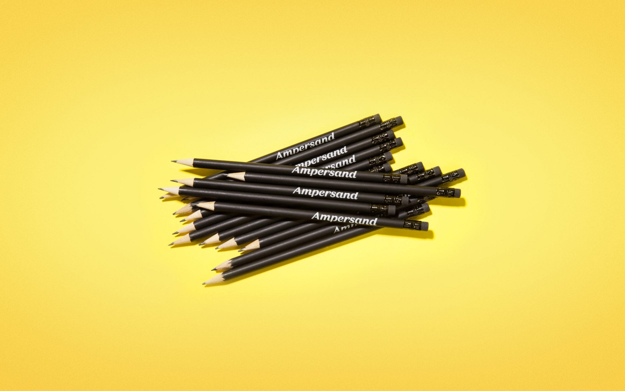
The following examples and those lovely pencils up top were all created by the team at Ampersand.