Stronger Together
In 2014, longstanding St. Louis construction firms Millstone Bangert and Fred Weber merged to form Millstone Weber. They wanted to reach new markets and partner with architectural firms on design-driven projects.
Our challenge was to design a visual identity that reflected the combined strength of these two companies. Another challenge: we only had two weeks to do it.
During a rapid-fire discovery session with the new firm’s PR consultant, we identified the attributes Millstone Weber’s brand needed to convey: foresight, imagination and staying power.
During our design workshop, the consultant suggested an iconic mark that would serve as a graphic shorthand for the new company’s mission. He trusted our guidance but expressed a preference for pictorial symbols over monograms or other typographic solutions. So what did we do? We explored many concepts, narrowed our options over several days, and then we presented a monogram. Thankfully, everyone agreed we managed to encapsulate Millstone Weber’s blended attributes and strengths. The client was thrilled and the PR guy’s blood pressure returned to normal.
Scope Visual Identity
Contributors Design: Ariana Schopp, Jason Tasso
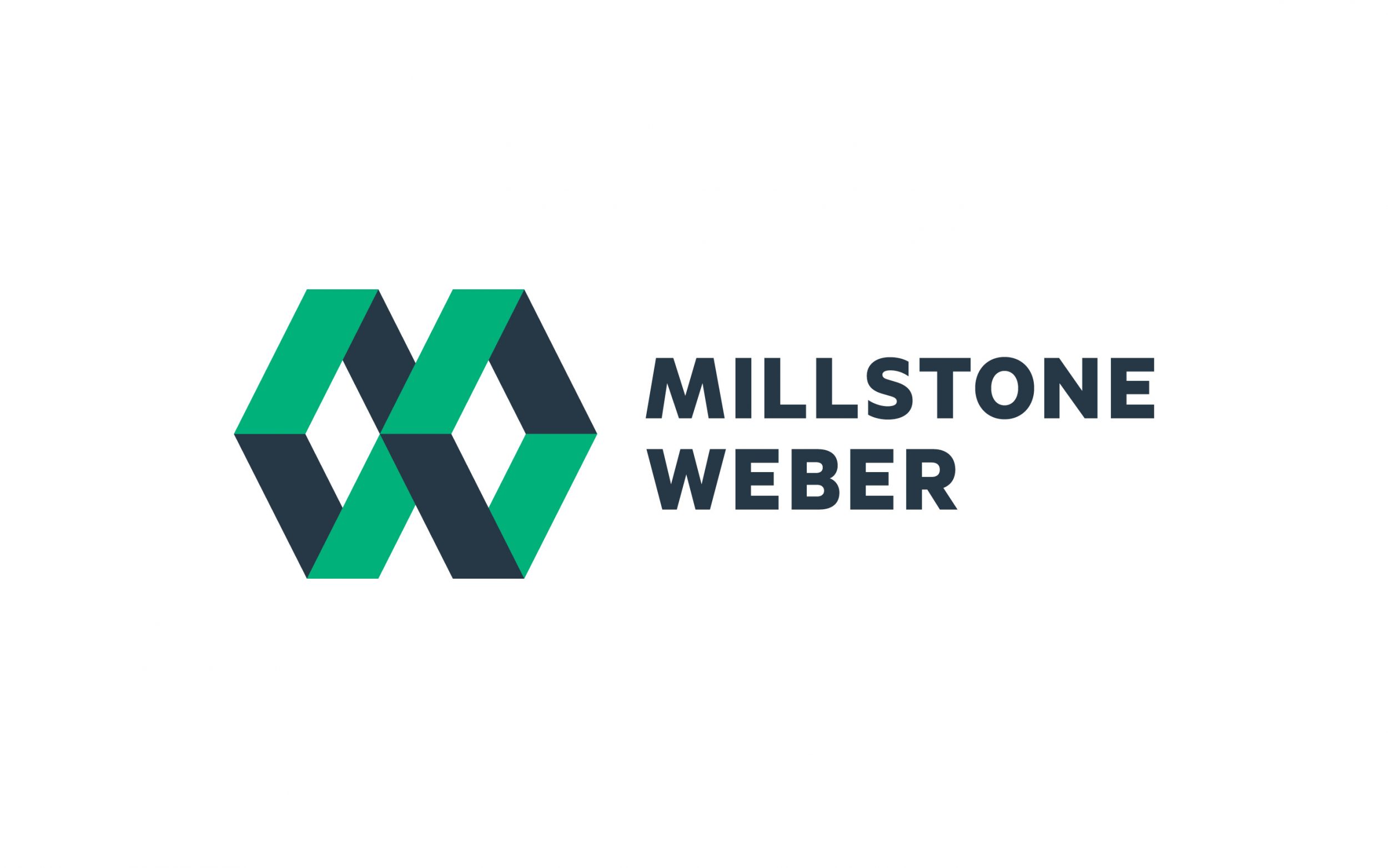
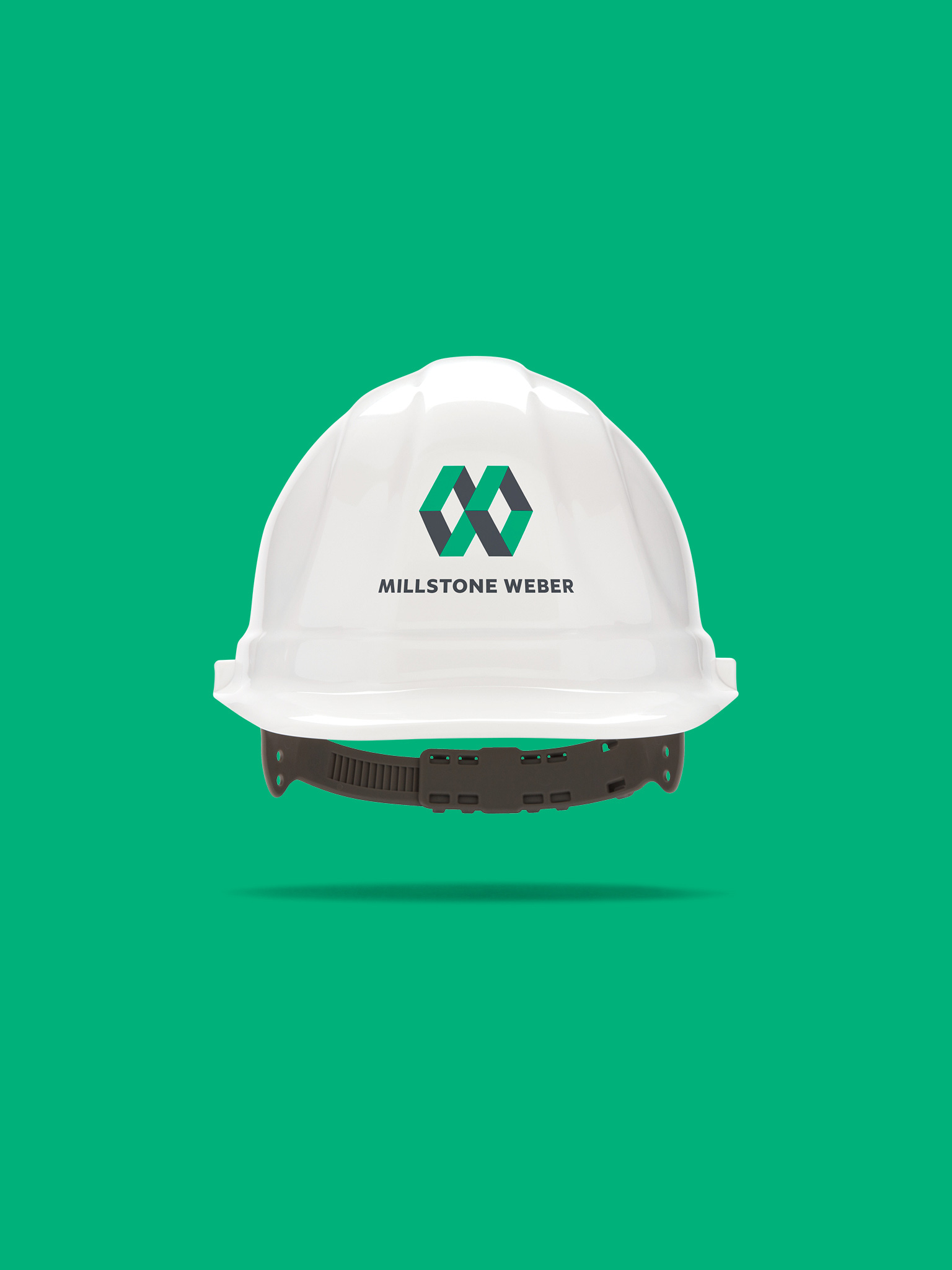
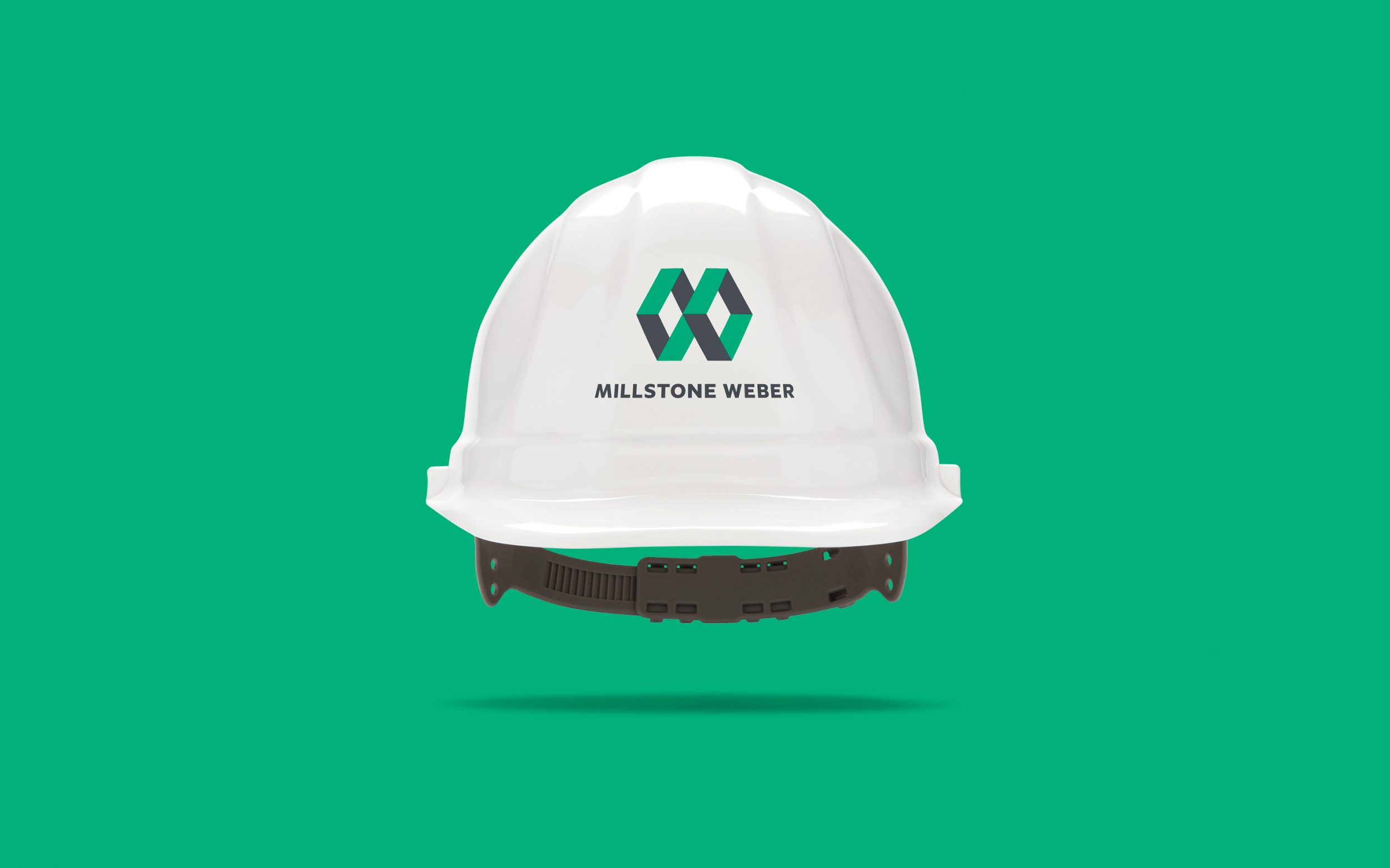
We based our concept on the strength and weight of combined experience. Together, Fred Weber and Millstone Bangert brought over 160 years of construction expertise to this new partnership.
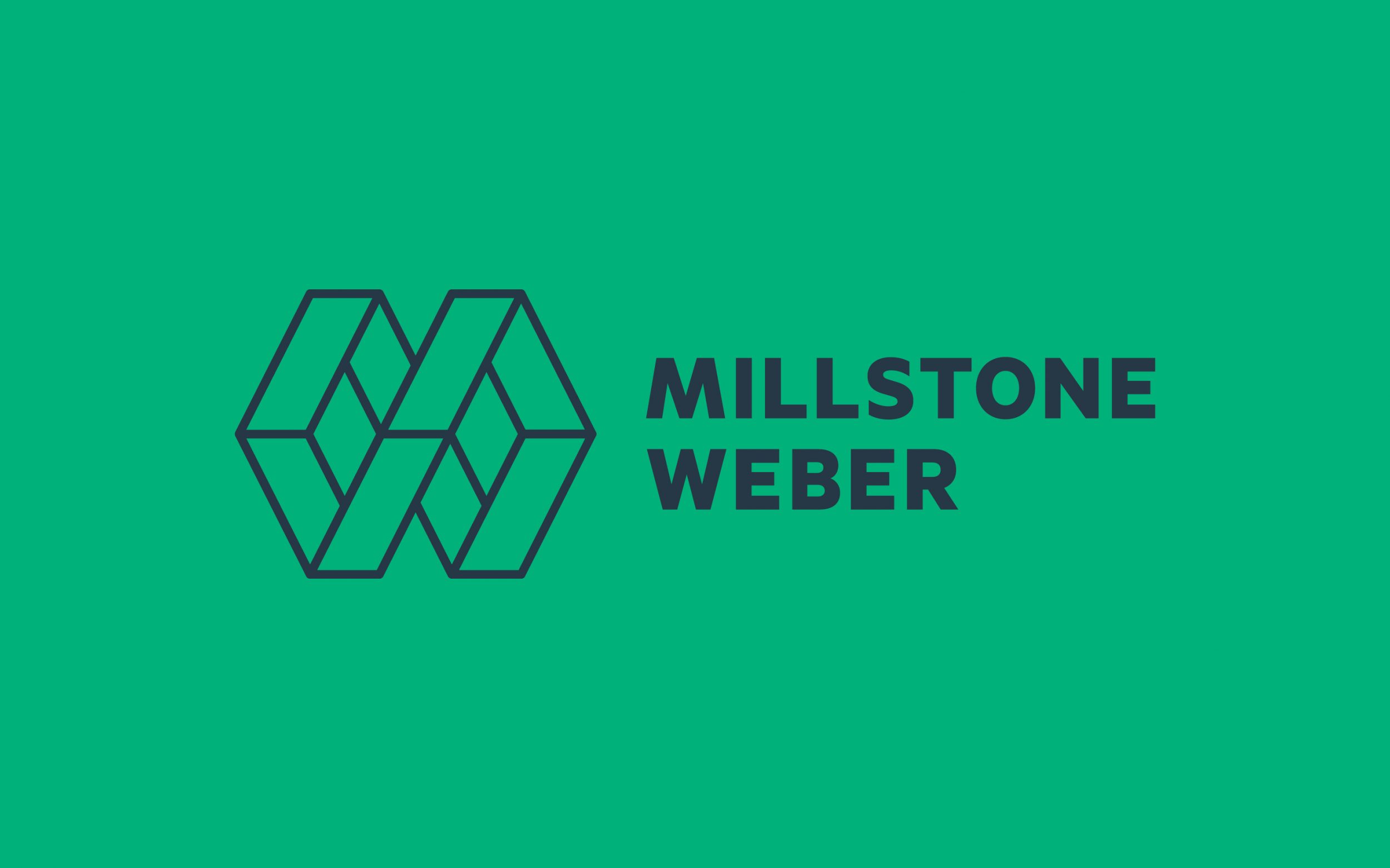
The monogram’s interlocking shapes form a hexagonal shape found all over construction sites from honeycomb foundations to bolts. The simple geometric construction lent itself to graphic shapes, patterns and animation. We created two versions for variety and flexibility, a solid two-color mark and a single-color outlined version.
Millstone Weber is devoted to sustainability and efficiency. Bright green was the natural choice for their primary brand color. We anchored it with a dark, cool gray, the color of wet concrete.
For brand typography, we selected a single font family. Klim Type Foundry’s Metric is a sturdy sans serif with sharp details. Metric is characterized by “engineered geometry,” as designer Kris Sowersby says, with humanistic curves providing friendly charm and legibility at all sizes from business cards to cranes. We drew custom M and W capitals for the logotype, echoing the mirroring effect in the monogram.
Matt led this project during his tenure as creative director at Grain. Thanks to designers Ariana Schopp and Jason Tasso, we met an impossible deadline and nailed it on the first presentation.
Powerhouse – Unused Concept
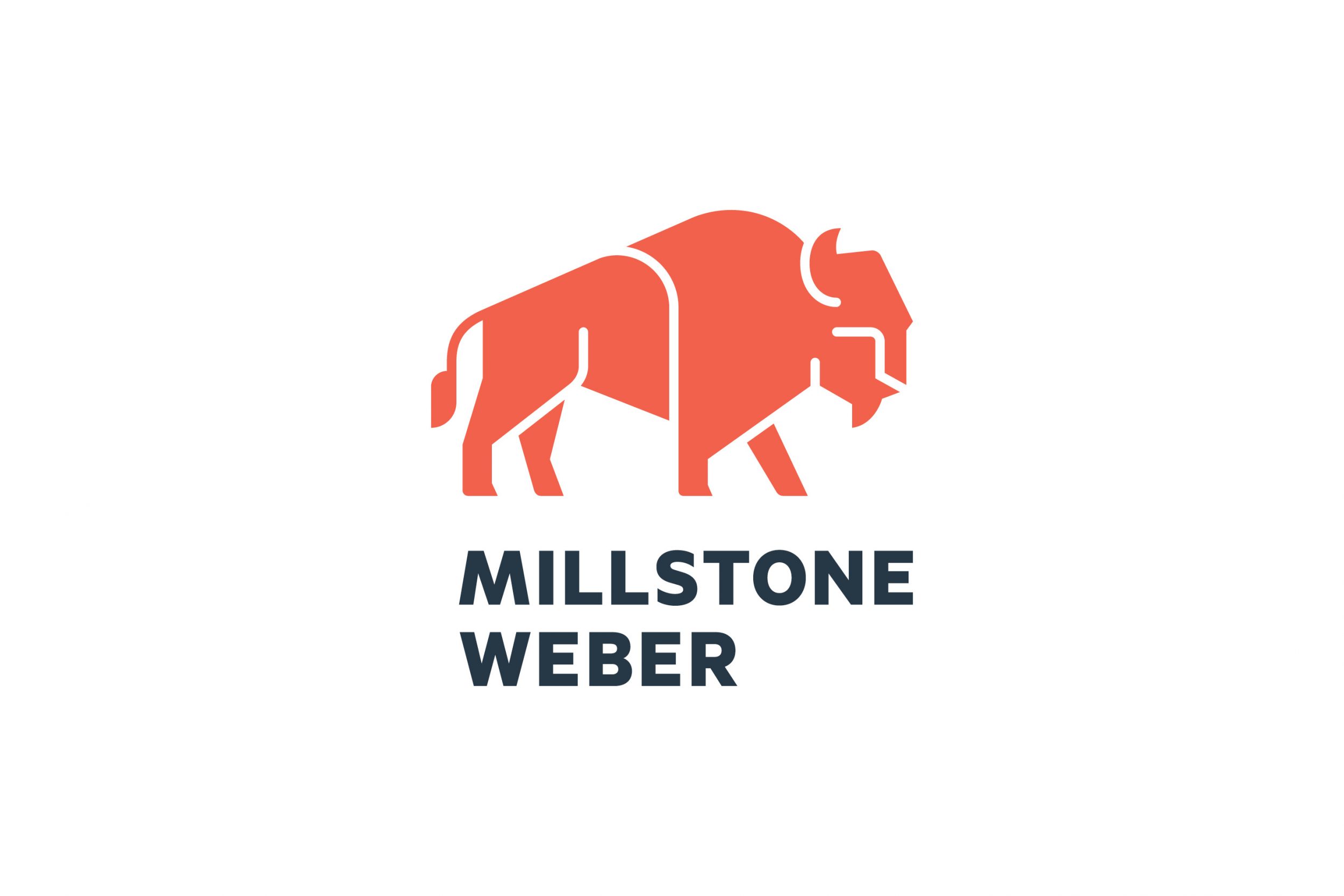
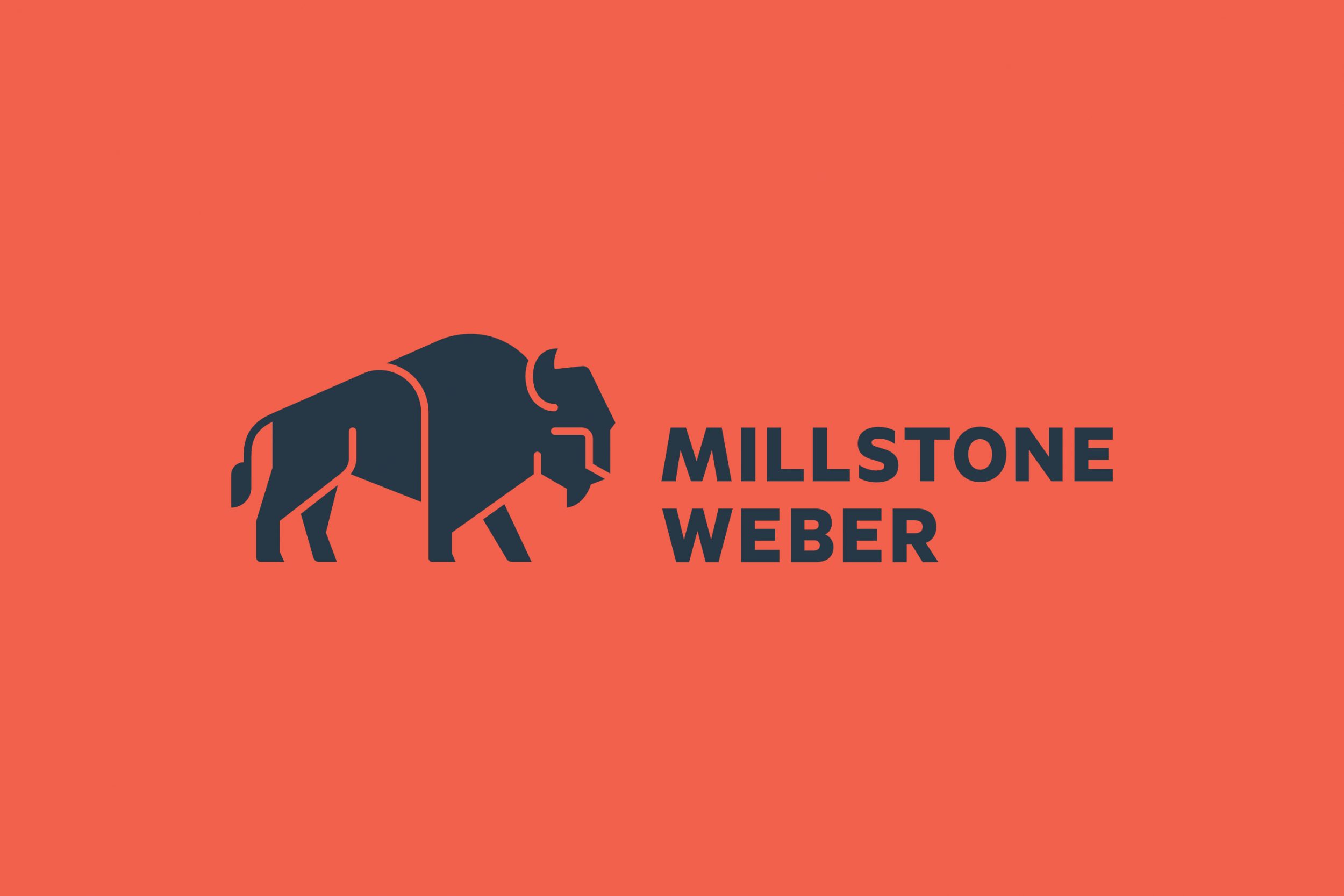
We typically propose a single direction for a client’s visual identity. In this case, we had two strong ideas – no fluff and no “safe” fallbacks. This second concept is all about staying power. Today, Millstone Weber has a solid presence in the Midwest. They want to broaden their national reach. Beyond that, their vision is to cultivate an international reach. We believed Midwestern roots could be an asset on the world stage.
The bison is at home among the rolling hills and enormous skies of the North American prairie. To Native Americans, the bison means strength, wisdom, abundance, courage and stability. To anyone, the bison is a force to be reckoned with.
At the end of the day, all of us felt the MW monogram best reflected who Millstone Weber is and where they’re heading. But the bison was pretty awesome. May he graze in peace!