Small Classes, Big Future
Stevens Institute of Business & Arts is a small, vibrant college in downtown St. Louis. With five degree programs in one four-story building, Siba has believed in the power of small since its doors opened in 1947.
The atmosphere at Siba is personal and friendly, but it isn’t for the student who wants a social experience and an education while they’re at it. There are no sports programs and Greek societies at Siba. There’s no quad or union.
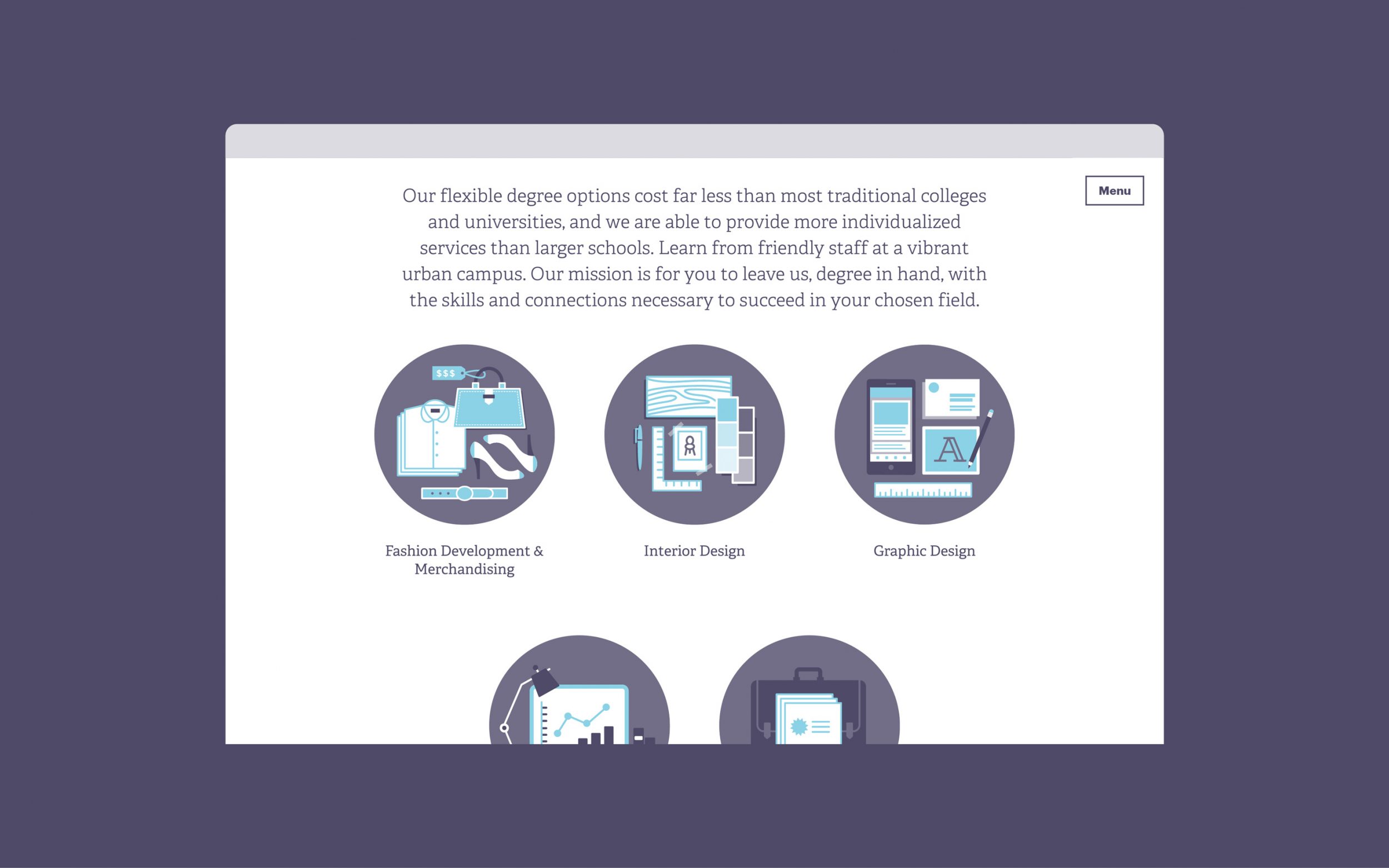
Siba’s approach is lean yet rich. Every teacher is actively working in their field. Classes feature an average 9:1 student-to-teacher ratio. Tuition and fees are dramatically less than most public and private universities. Costs are locked in when you enroll. And with options for accelerated 18 and 36-month programs, you can begin a career and gain independence ahead of your peers.
For students who gravitate toward intimate environments and focused degree programs, Siba has much to offer. But for decades, the school struggled to be seen and heard amidst fierce and better-funded competition. When we first met Siba’s leadership in 2014, they wanted to generate more interactions with prospective students, increase enrollment and cultivate a more diverse student body. But they weren’t sure how or where to start.
Scope Brand Strategy Naming Visual Identity Copywriting Art Direction Print Collateral Environment Signage Website
Contributors Copywriting: Anna Stalker Design: Ben Proell, Ariana Schopp, Jason Tasso Photography & Video: Brett Crow & Matt Seilback Web Development: Alex Agatstein

In this Case Study
Identity Brand of Misfits
All of this work took place during Matt’s tenure as a partner and creative director at Grain, and it was a full-team effort over the course of a year.
The first time we visited Siba, we were unsure what to expect. We hadn’t seen any pictures of their campus ahead of time, only their website and current branding. The website was outdated, difficult to navigate, and illegible on a phone. Likewise, their brand identity lacked originality and distinction. The logo had a somewhat dated, Victorian feel, and there was a lack of coherence in all of their visual communications.
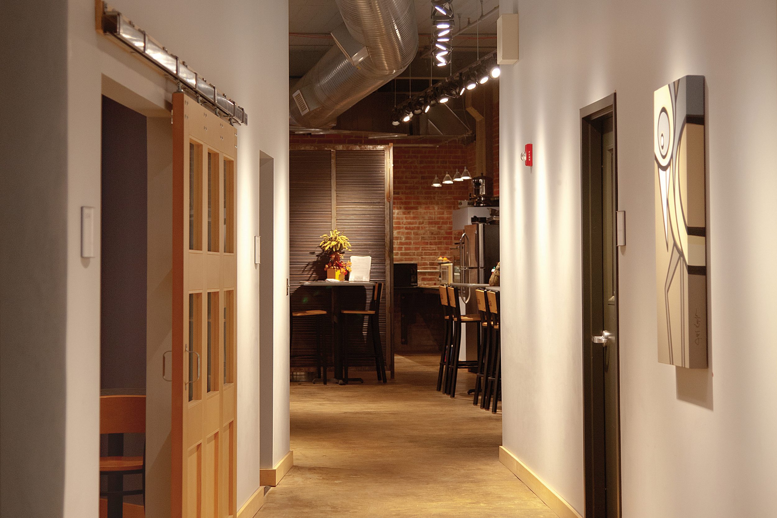
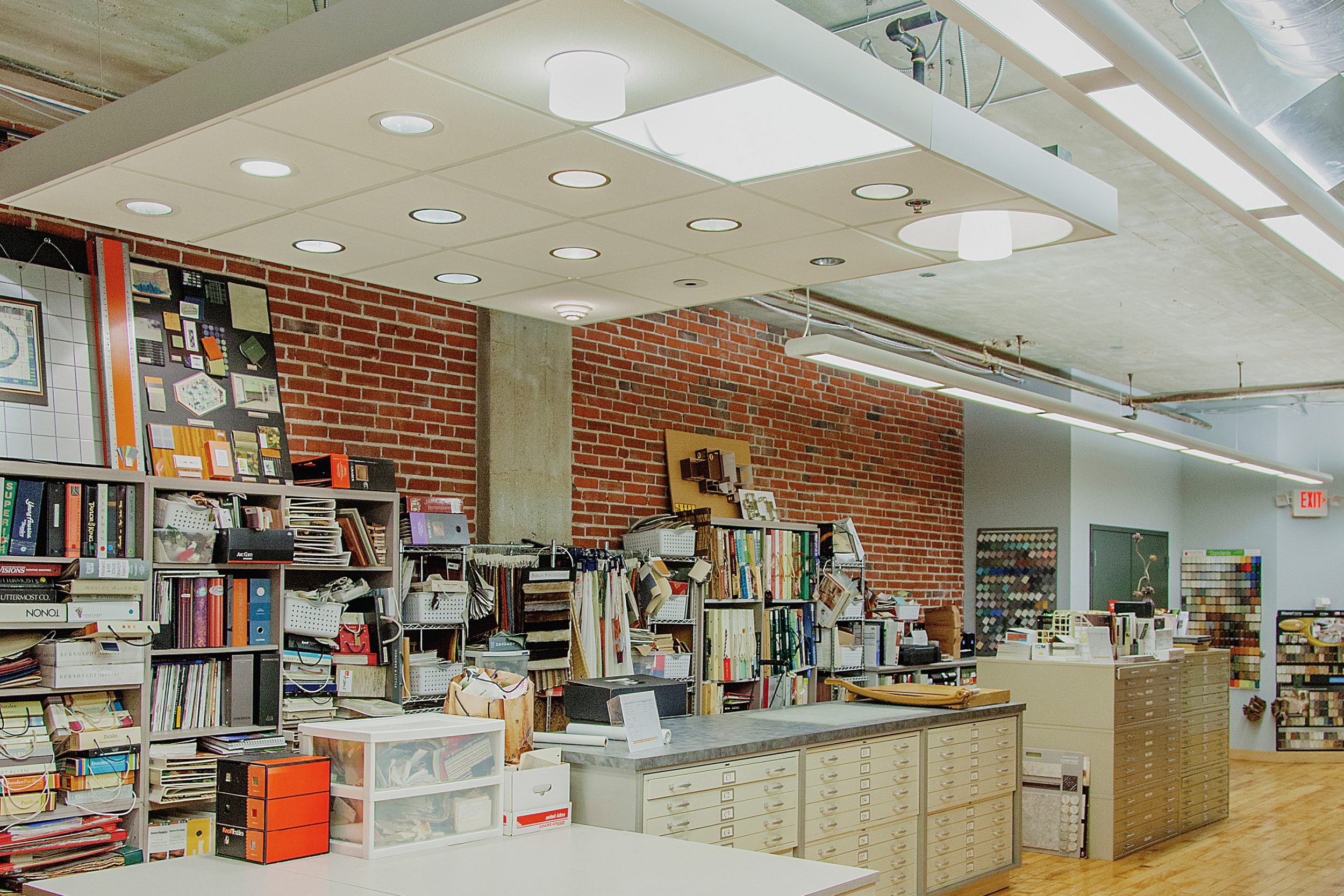
Entering the building, tall ceilings, polished concrete floors and exposed brick greeted us. Tasteful, contemporary lighting fixtures and bright, beautiful paintings added warm energy to the space. Common areas and classrooms were also well-appointed, with large windows and ample natural light – tons of character and totally different from most college buildings. We were pleasantly surprised. The things we’d seen online told a completely different story.

At that moment, we realized Siba had an image problem and a communication problem. Our intuition was confirmed when we met President Cynthia Musterman and listened to her hopes for students and the school.
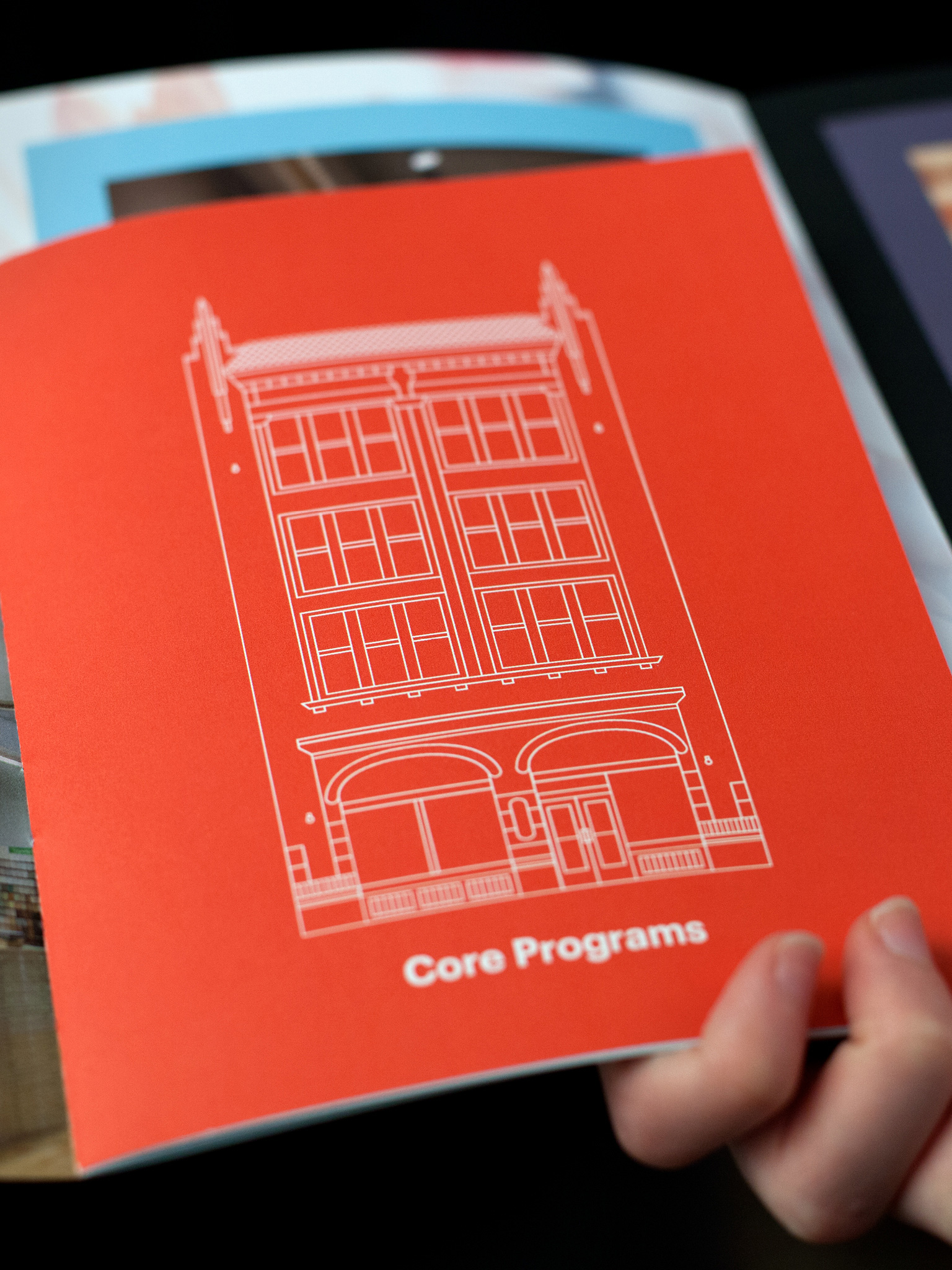
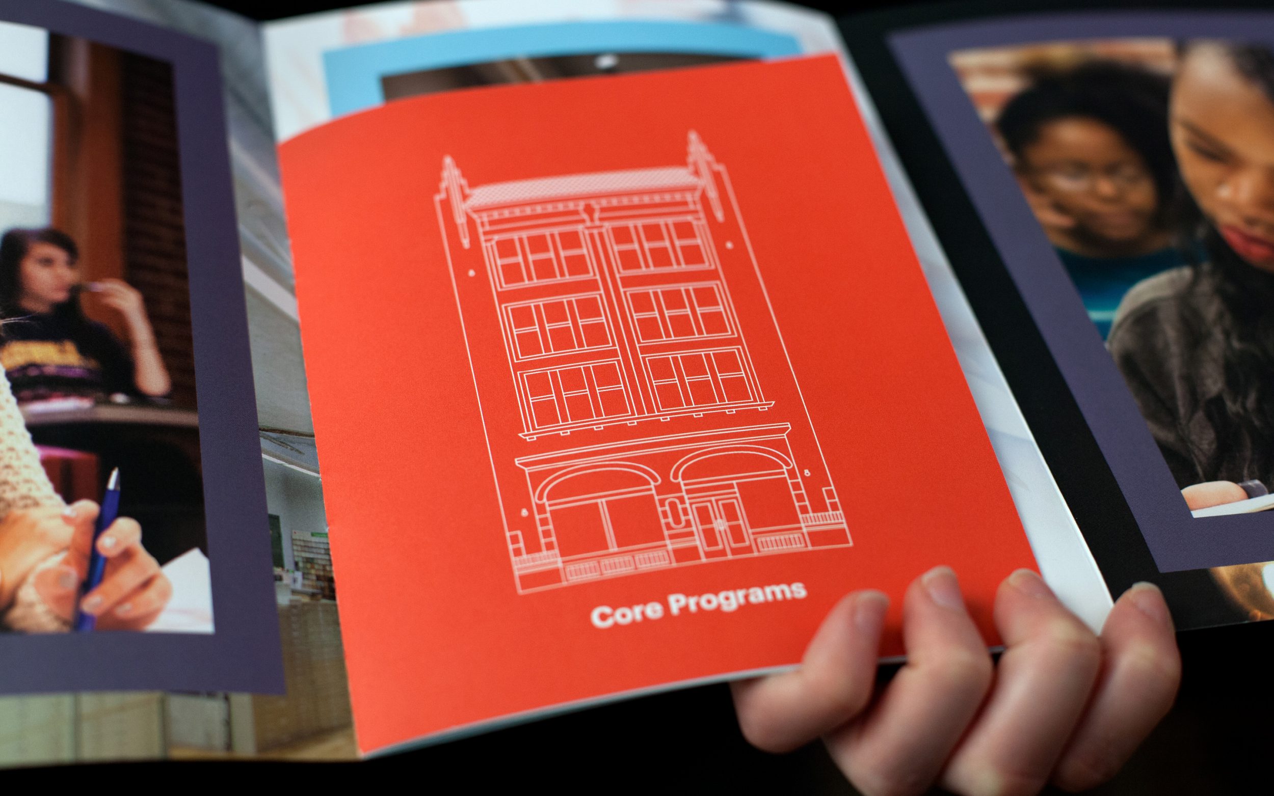
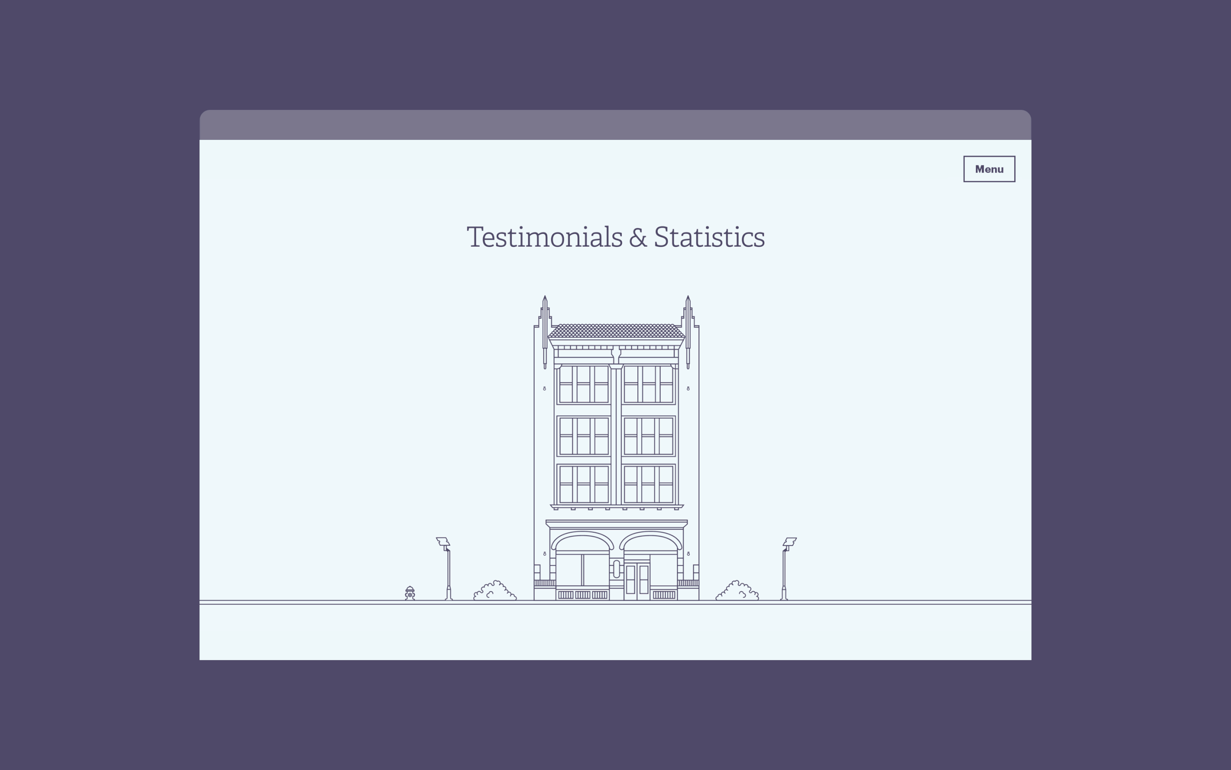
We proposed a complete overhaul of Siba’s brand identity, website and core collateral. During discovery, the team proudly described themselves as a band of misfits. They were proud of their urban environment and no-nonsense approach. They were ready for change, but the one thing they asked us to keep was some kind of graphic representation of Siba’s quirky building.
After we learned about the school’s values, personality and pain points, a brand design brief emerged.
- Create a shorter, memorable graphic signature for Siba.
- Move away from the acronym, and own “Siba” as a word.
- Keep the building symbol, but redesign it.
- Build the visual identity around two core elements: a logotype or a custom typographic setting of Siba and the building.

Rarely does an organization have an acronym that’s not only legible as a pronoun but also pleasant to the ear. Rather than a coat of arms or monogram, we designed a compact and dynamic logotype to serve as Siba’s primary graphic signature. We knew its stenciled letterforms would feel right at home in downtown St. Louis.
The building is a second-tier element with two versions. The seal functions as a mark of authenticity or a last impression. A large-scale version invites clicks and scribbles.
The resulting cocktail is a flexible brand identity that isn’t so much about a logo as a system of interdependent elements. The new system as a whole is confident and collegiate yet bright, contemporary and a little offbeat.
Website Business of Arts, Art of Business
We created an all-new website that immediately gives visitors a sense of the school’s physical, freshly-painted space. A video at the top of the homepage walks you down a hallway toward the cafeteria and across classrooms. Visitors can immediately apply or watch a full-length video about Sibal’s programs and culture.
It was critical to quickly and prominently highlight what sets Siba apart. For example, all graduates receive lifetime placement assistance. And, once accepted, first-time students have 30 days to attend classes, risk-free. Several of these stats appear below the intro video in playful thought bubbles that invite investigation.
Following the style established by the building seal and illustration, we created a series of playful illustrations for each program.


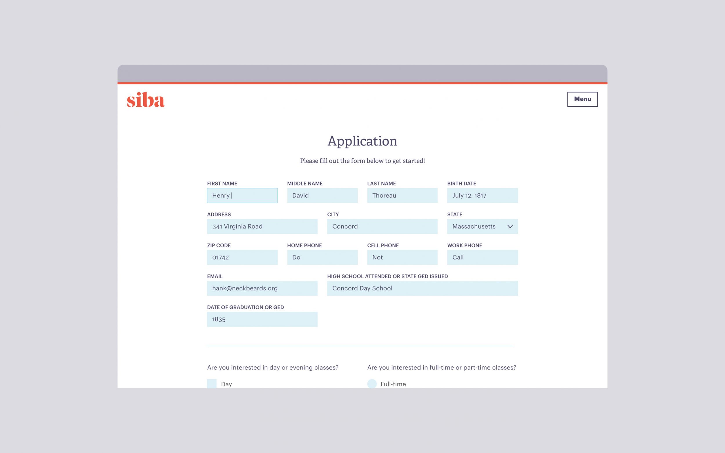
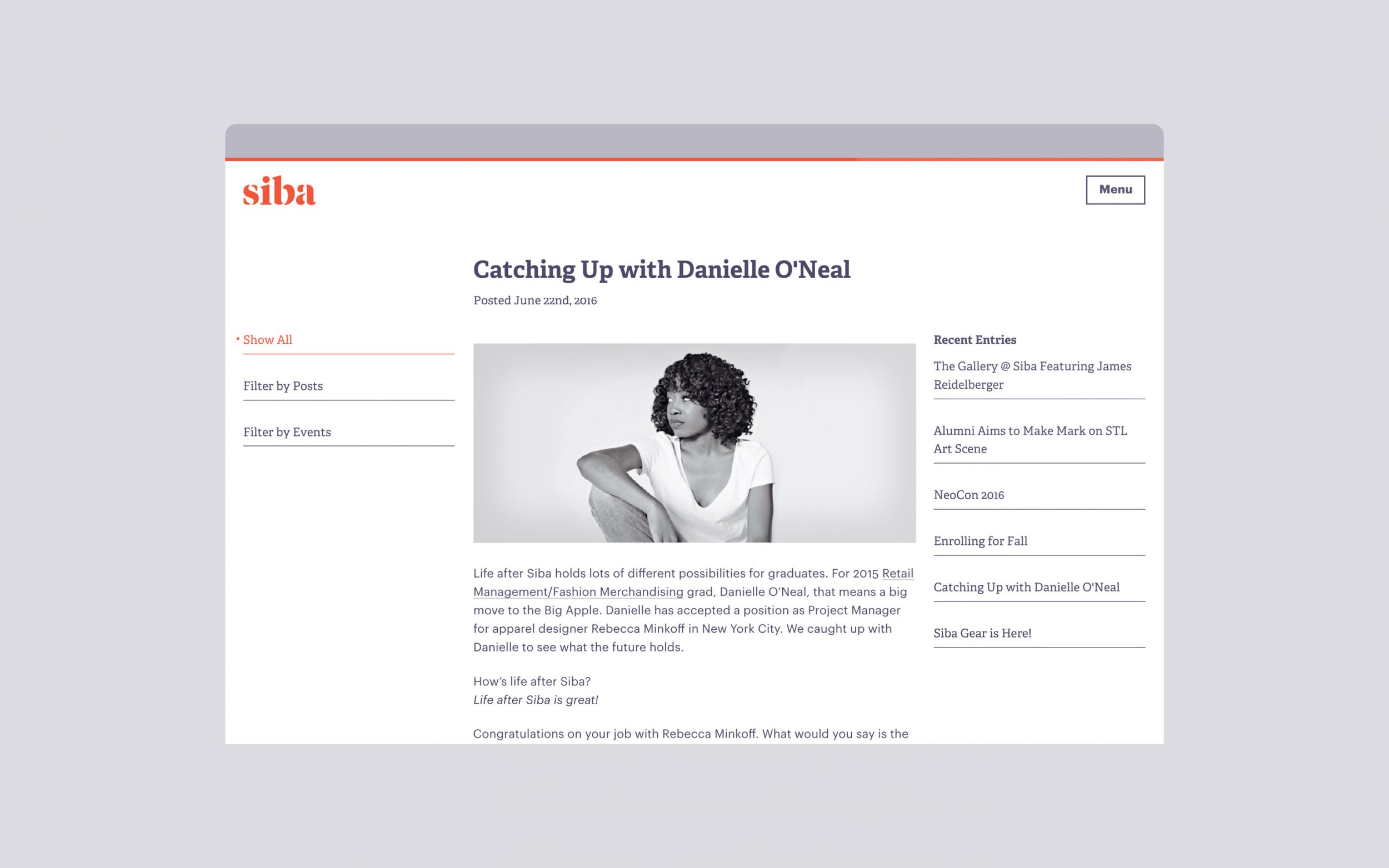
Whether you’re on a laptop or a phone, the application process is a breeze. You can subscribe to Siba’s email newsletter from anywhere on the website. And a revamped blogging schedule invites subscribers to return, learn and find inspiration.
Collateral Into the Fold
Business cards and stationery remain essential for first impressions, especially for a school that prides itself on small classes and personal care. We designed business papers for Siba that are professional, crisp, and a little peculiar.
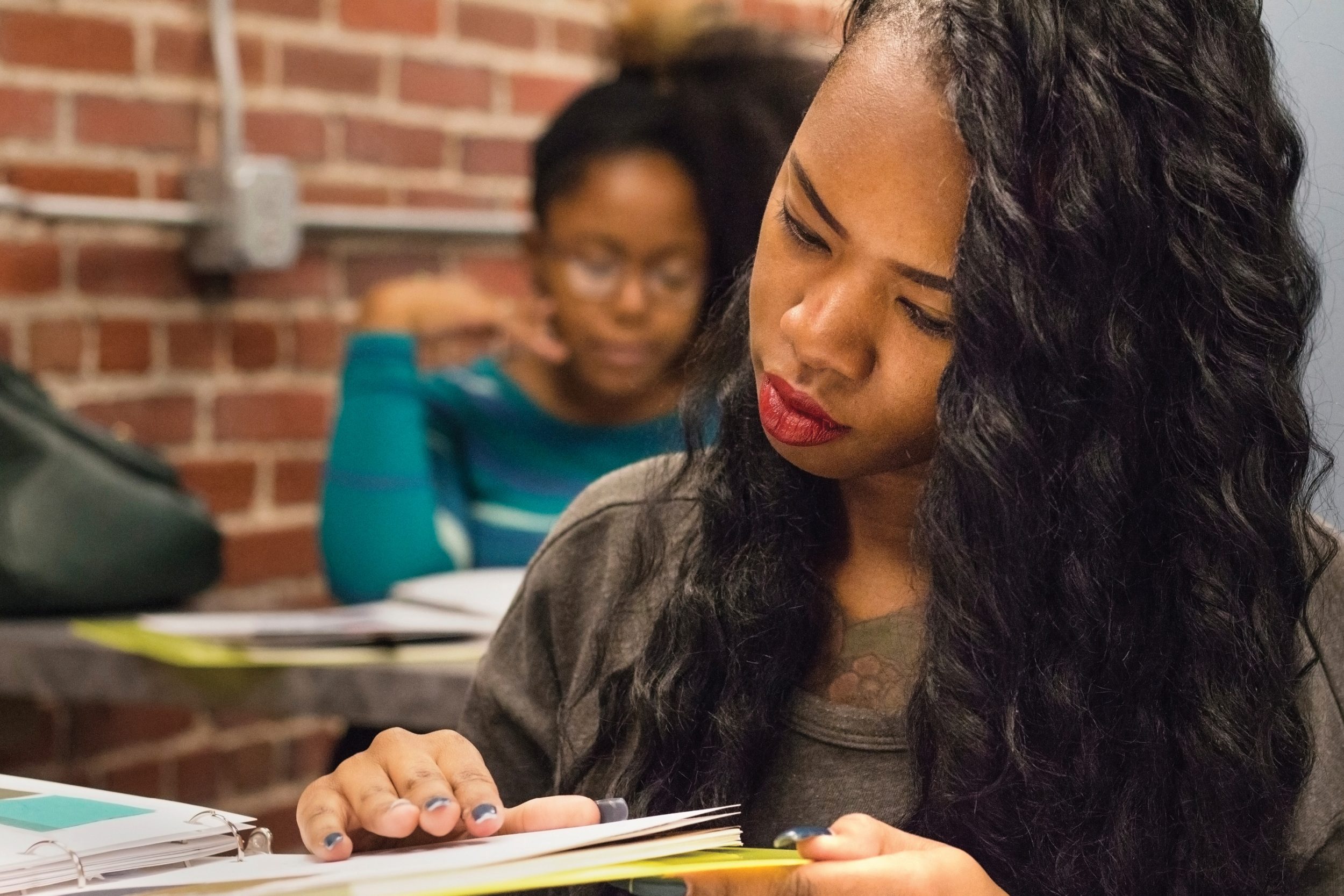
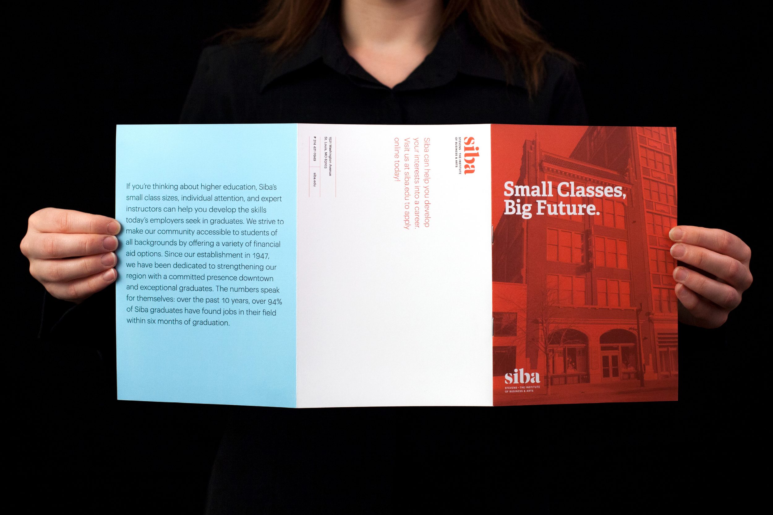
We also designed a dual-audience, dual-purpose brochure. Siba wanted to create a memorable print piece that would resonate with parents as well as prospective students. Our solution was a small, unorthodox brochure with vibrant images of the school and students.
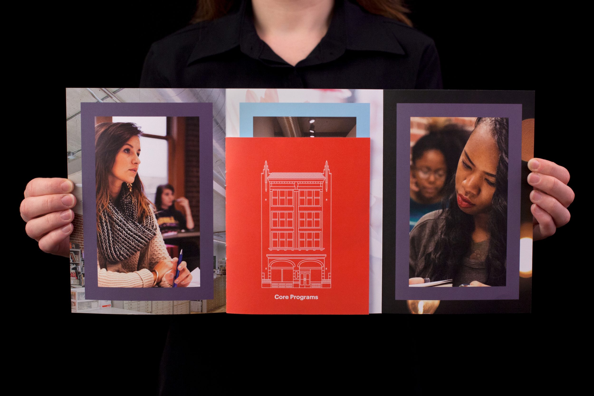
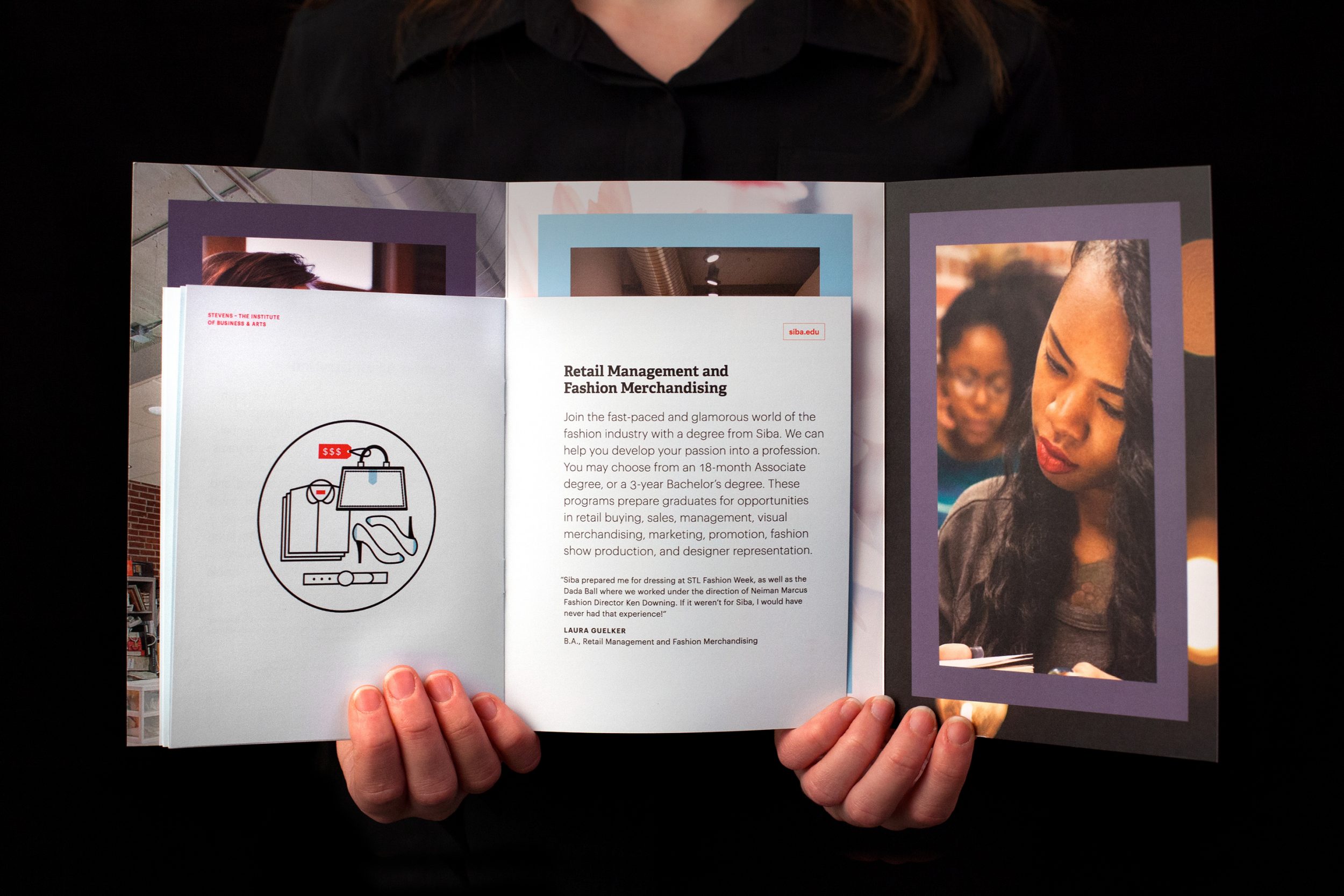
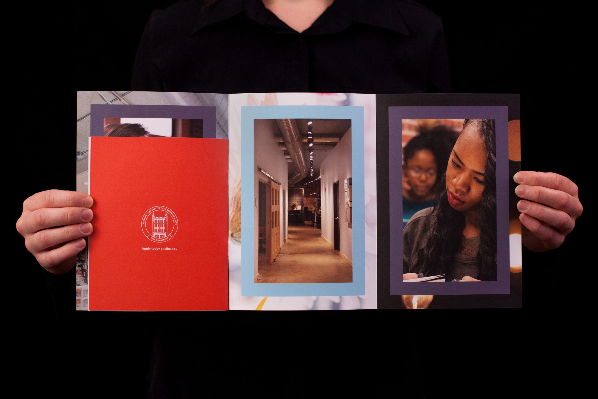
We highlighted the impressive job placement results of recent graduates. Brief program descriptions and testimonials illustrate how Siba can help students develop their interests into careers.
Siba wanted to use these brochures as job fair takeaways as well as for targeted mailings. To that end, the back cover doubles as a mailing panel.
Today, Siba boasts a brand experience that fits its vibrant environment and culture.
The disconnect between online and in-person impressions is gone. Siba remains a gem, though no longer hidden. Most importantly, our work is helping them increase enrollment and foster engagement with current students and alumni.