Building Firm Foundations
Silverback Concrete is a family‑led team of heavy‑concrete specialists. They build commercial structures for contractors who expect unrivaled quality.
When we first met then-named Southeastern Concrete, they were ready to rebrand, but we could see that a new verbal and visual identity would only take them so far. Their name wasn’t memorable or distinctive, and a quick search turned up at least nine other companies in the US with the same name. It was time for a new moniker, as well.
Scope Brand Strategy Naming Visual Identity Copywriting Art Direction Print Collateral Environment Signage Website
Contributors Photography & Video: Nathan Bolster Web Development: Kyle Hagler
In this Case Study
Research Insights & Personality
What We Heard
“I hand-deliver water to my laborers to let them know how much I appreciate them. I love taking them out to dinner. One guy told me I was the only boss who’d ever hugged him. I really do appreciate our crew – 100-degree heat, rain and cold – they’re always out there banging away. I’m here to lift them up.”
“Frank was designed for this job. He’s the head coach of heavy concrete. I call him ‘Dr. Love.’ His heart is definitely for the industry, but it doesn’t stop there. One of their best finishers built an orphanage with Frank in Mexico. Now, we have a missions program that’s supported by college football coaches and churches – and it all started because of concrete. The missional aspect of Frank’s work goes far beyond foundations.”
“One of my favorite hymns is ‘How Firm a Foundation.’”
Pouring the Footers
At Steel Brothers, we use the Enneagram, a framework for self-knowledge, to develop key components in every client’s brand strategy from tone of voice to purpose, mission, vision and values. Our objectives are always authenticity and magnetism, but the approach varies. Sometimes it makes sense to treat a brand’s voice or personality as a fictitious character based on one of the nine core types. At other times, there’s one leader whose qualities permeate an organization’s culture and attract customers.
In this case, Frank Stankunas, the company’s founder, was our ideal starting point. Frank has a strong social instinct and exhibits traits of types Eight and Nine, often called the Challenger or Defender and the Peacemaker (respectively). He’s energetic, kind, hardworking, rugged and optimistic. He has a heart for the under-served. These attributes became the mold for their brand’s voice.
Brand Messaging Concrete Purpose
A brand’s position, purpose and values are like cardamom, saffron, vanilla – precious ingredients in any strategy. When your product is a commodity, your why and how become even more valuable. Without them, you’re virtually brandless.
We led a brand language workshop with the client team, laying groundwork for several aspects of their brand strategy and verbal identity. We unpacked what it means for them to cultivate a Challenger brand with a kind heart. Peeled back their audience’s problems on several levels from obvious to unconscious. Identified criteria for naming. And we led a purpose mad libs session to uncover the company’s reason for being.
The statements below are just a few highlights from Silverback’s brand strategy and messaging. The strategy armed them with internal guidance for building their culture as well as evergreen copy for external communications.
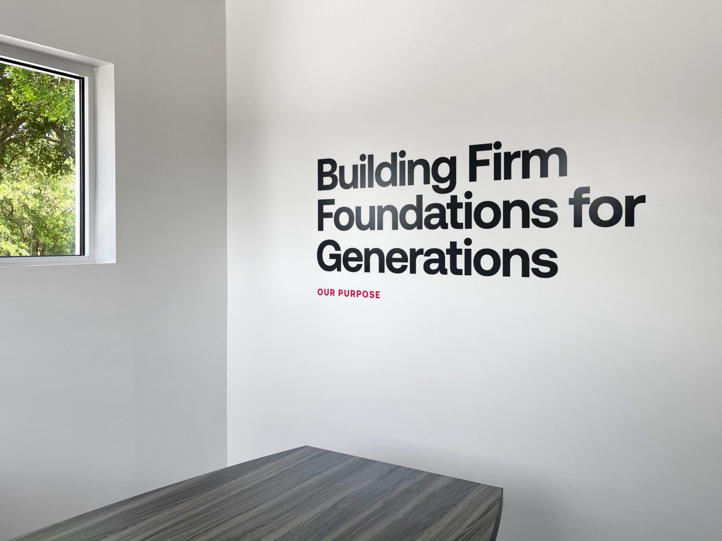
Why we're here
Building Firm Foundations for Generations.
What do we do & how
Concrete & Steel. Precision & Grit.
The raw and human materials of our craft are simple yet powerful when put to good use. Through time-tested know-how, exacting standards and rugged workmanship, we pour and finish structures that can weather any storm.
The problem we solve
Carelessness Is Costly.
You’ve got 16 subs to manage. A cold front is moving in. The owner added a fourth floor and the move-in date is non-negotiable.
“Construction management is for the fainthearted,” says nobody ever.
When it comes to the crews you rely on, you need carelessness like you need a hole in your head. This rings truer for concrete than any other aspect of construction. There is, quite literally, a lot riding on it.
You need pros and team-players who sweat the details. Who respect your budget. Who can handle concrete in any form from footers to elevated decks. And you’ll get the most value from a leader who cares about the people grinding away on the job today as well as those who will use the finished product tomorrow.
How we're different
Some concrete companies specialize in one kind of terrain. Or they compete by racing to the bottom. At Silverback, we deliver rock-steady solutions from hilltops and hollows to marshlands and coasts. And we do it with safety and speed so you can rest easy and finish on time.
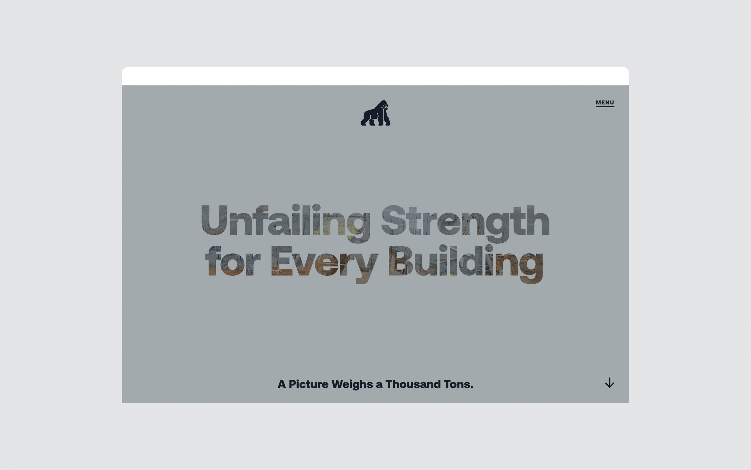
What we want
Unfailing Strength for Every Building.
Tagline
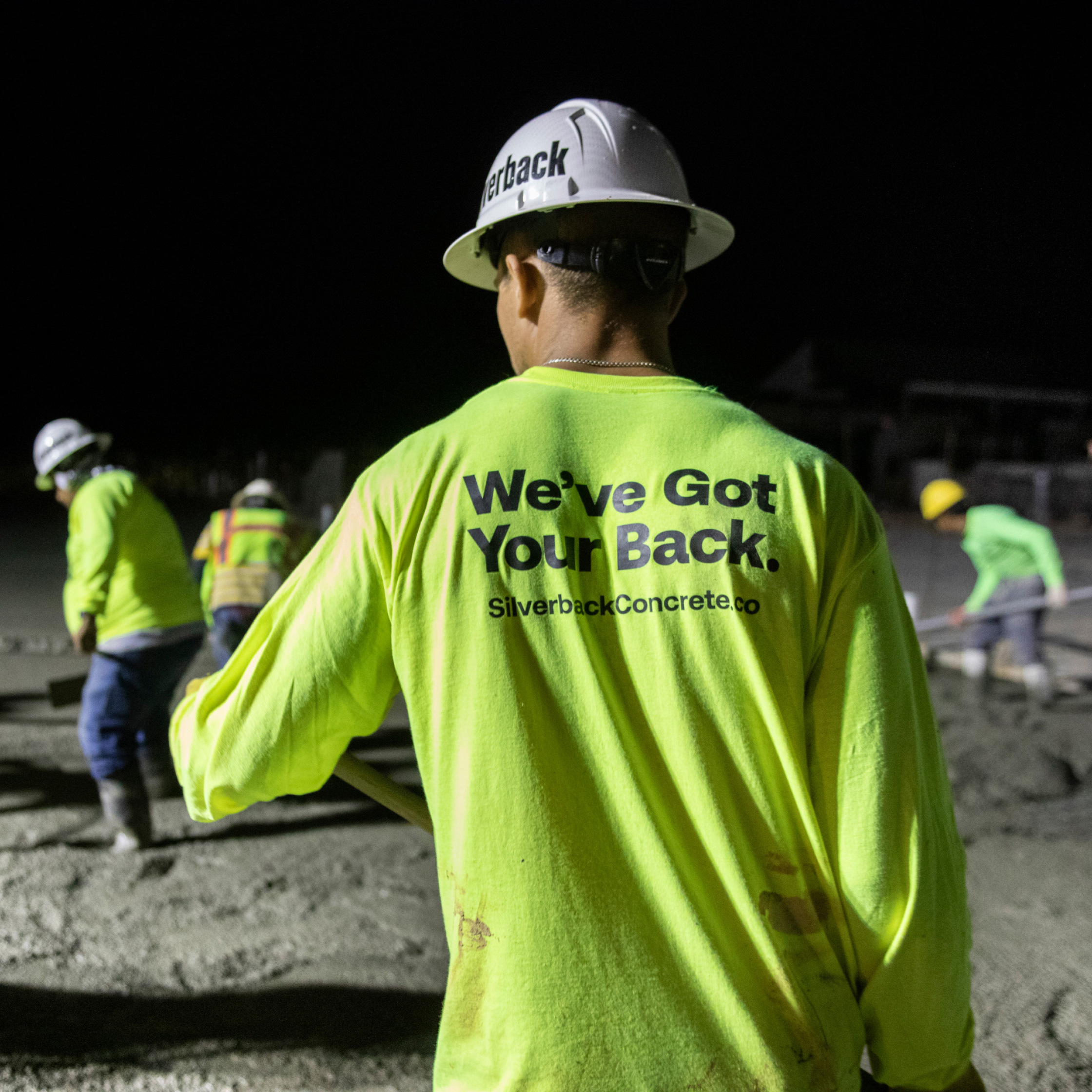
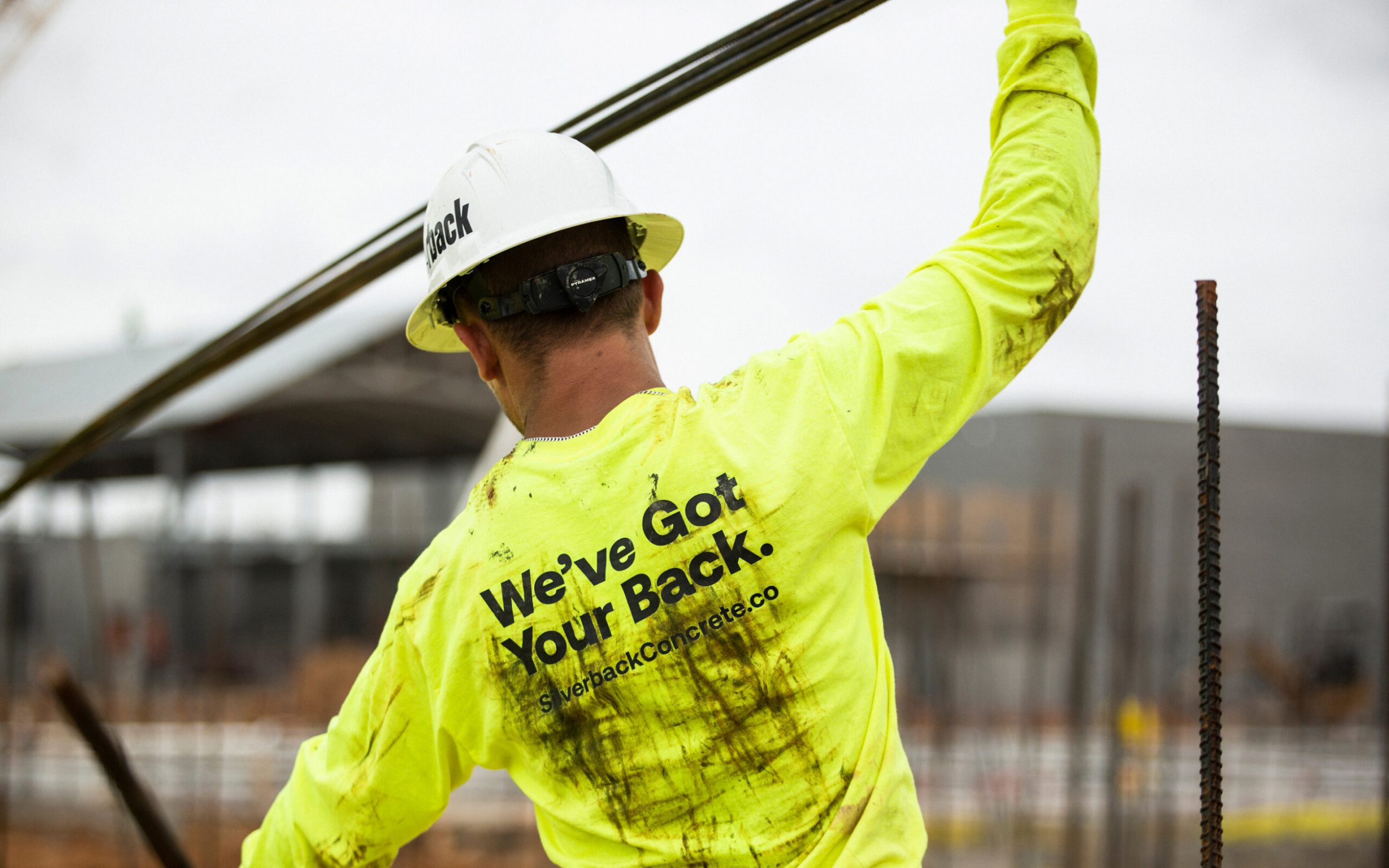
We’ve Got Your Back.
Naming Moniker Matters
A slide from our naming presentation to Silverback, which included 20 names across seven categories.
With the brand strategy established, it was time to tackle naming. There are more than 30 different kinds of names out there (and counting). Narrowing down our approach with the client prepared them for the daunting task of choosing a new name to plaster on everything from their new building to social media.
We wanted the new name to evoke the feeling of assurance. The construction market is cold, and company names tend to be forgettable. We wanted to be warm and lively. To create a clear image in the mind.
From more than 150 names, we identified eight front-runners.
Hill & Hollow
Pax Concrete
River & Ridge
Silverback
Treadfast
True Foundations
Trust Foundations
Urso Concrete
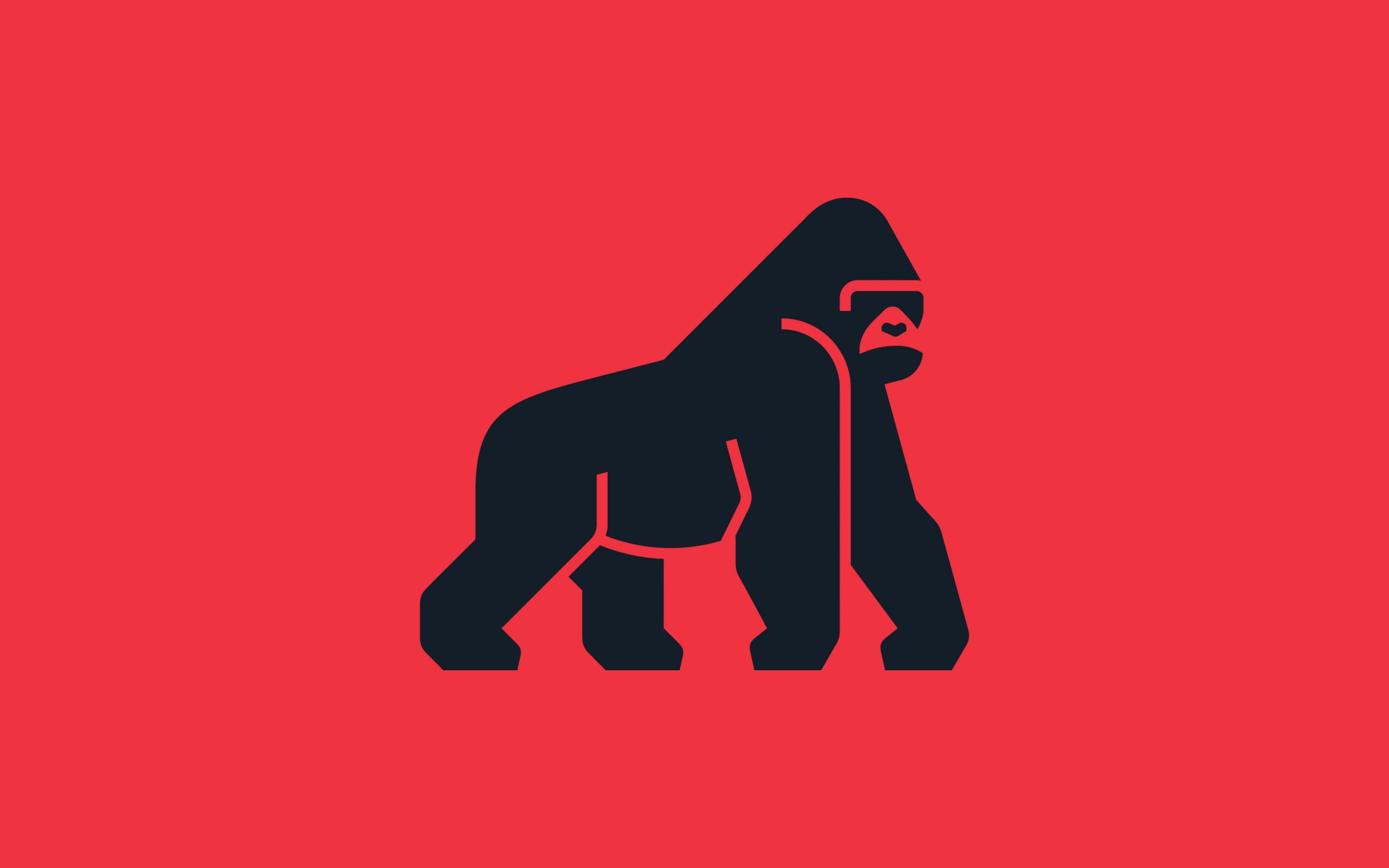
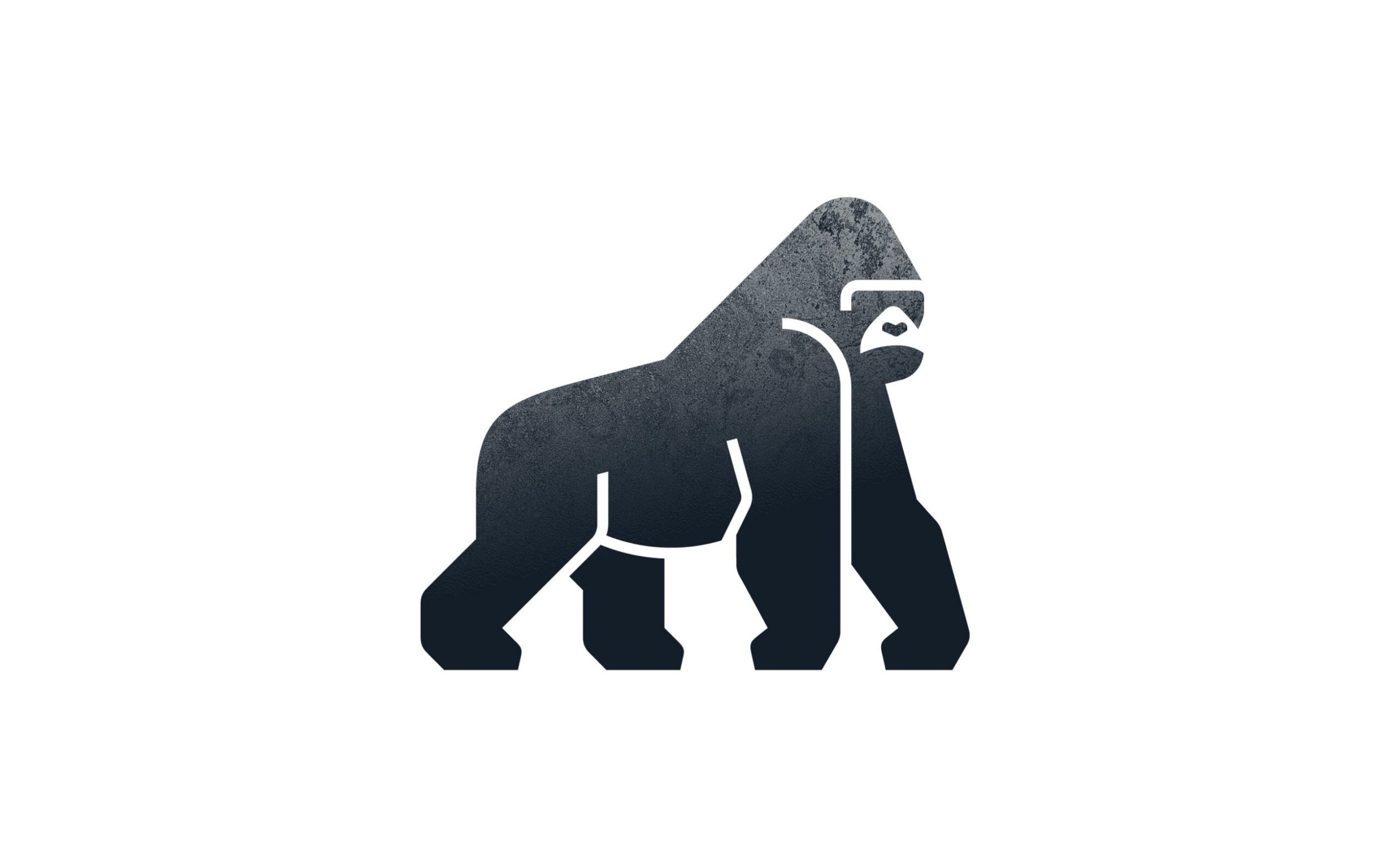
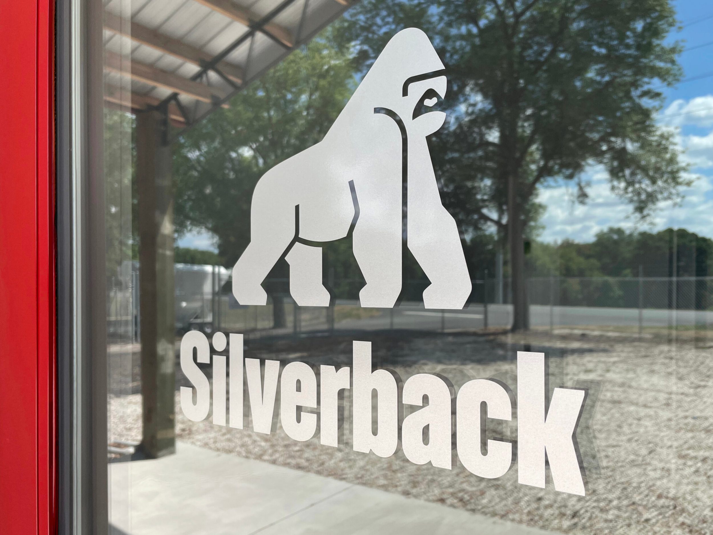
A unanimous favorite emerged from the first round. What could be more assuring than a powerful, peaceful, silverback gorilla?
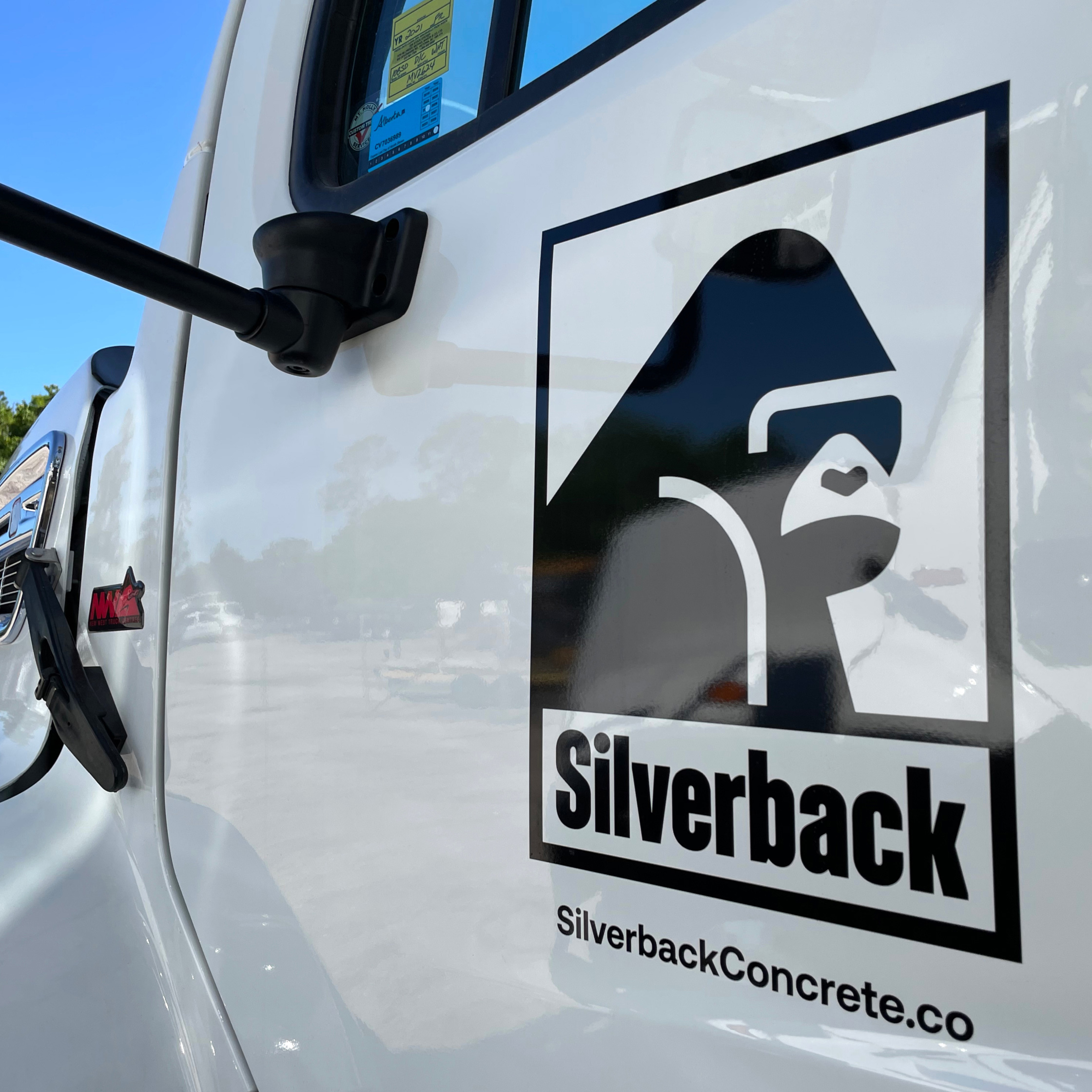
Visual Identity The Face of Assurance
With a name that pushed us firmly into alpha-simian mascot territory, the question surrounding Silverback’s logo became, “what kind of gorilla do we want?” How might we create a concrete-inspired character with plenty of, um, character – while steering clear of cartoonish or tattoo-parlor vibes?
Meet Mack.
Every mascot needs a good backstory.
Mack Silverback is a seasoned cement mason and the five-term mayor of Simian City. Mack’s been around the block a few times and has the silver hairs to prove it, but he can still flip a VW bus without breaking a sweat. He graciously accepted a position as Silverback’s namesake and mascot in 2020.
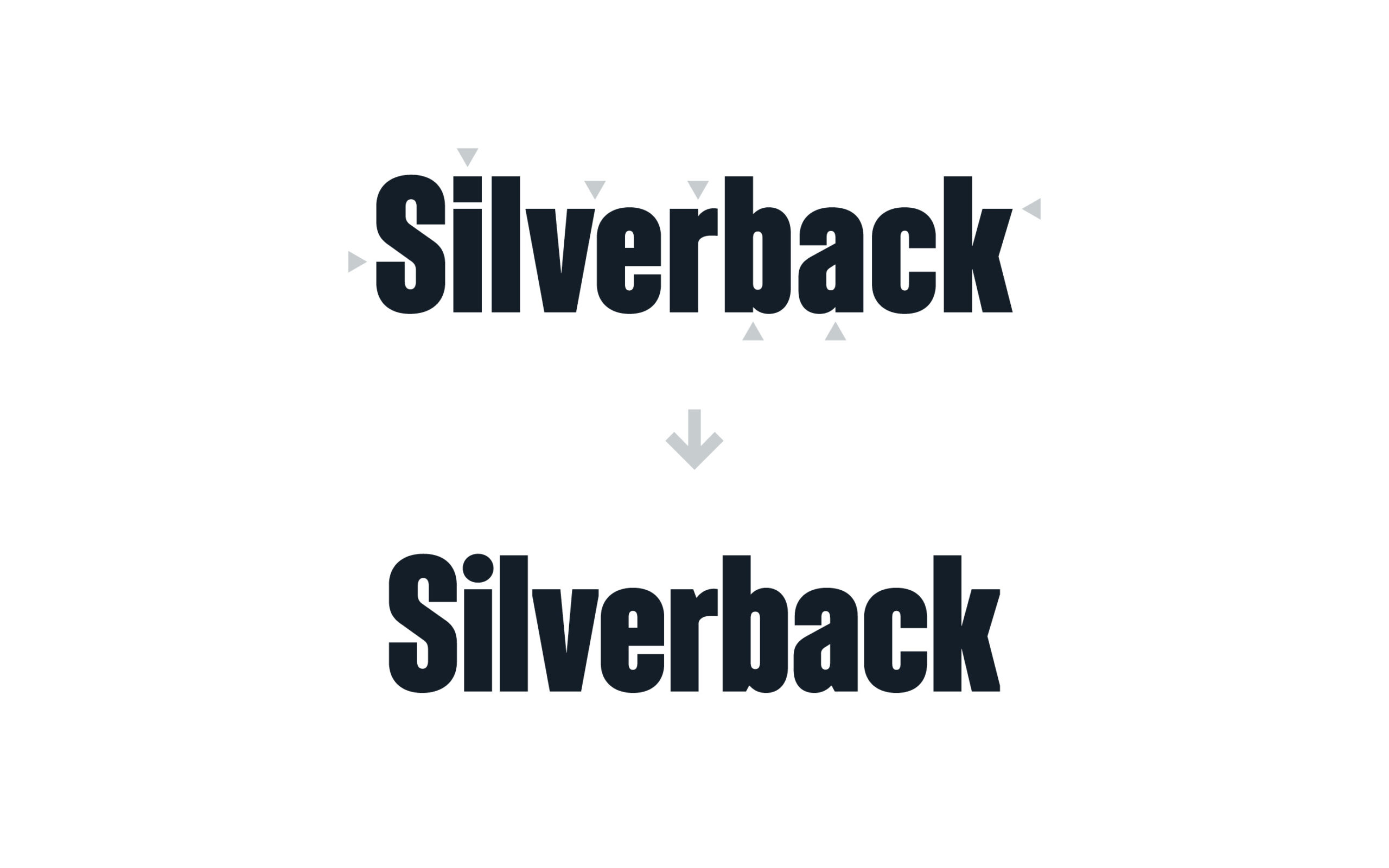
Based on Söhne Schmal from Klim Type Foundry, the logotype takes inspiration from Silverback’s comfort with tight tolerances and harmonizes with the shapes in Mack’s heavy silhouette. We created two versions, one for general use and a large-scale version with ultra-tight spacing.
In our design workshop, we reviewed various typefaces that could carry Silverback’s message across all media. The team gravitated to a pairing of sans serif and serif styles for the sake of utility, variety and distinction. We settled on Aeonik, a sans serif with rigorous geometry and friendly details for the primary typeface. Guardian Egyptian, a highly readable and contemporary serif, holds down the fort for body copy.
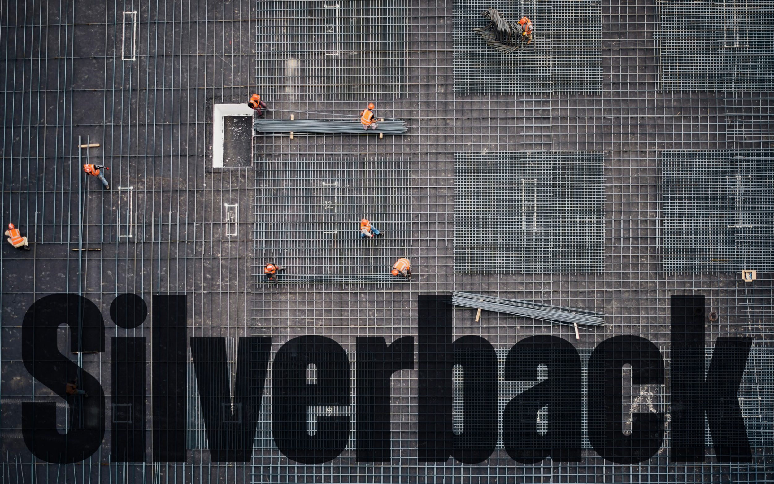
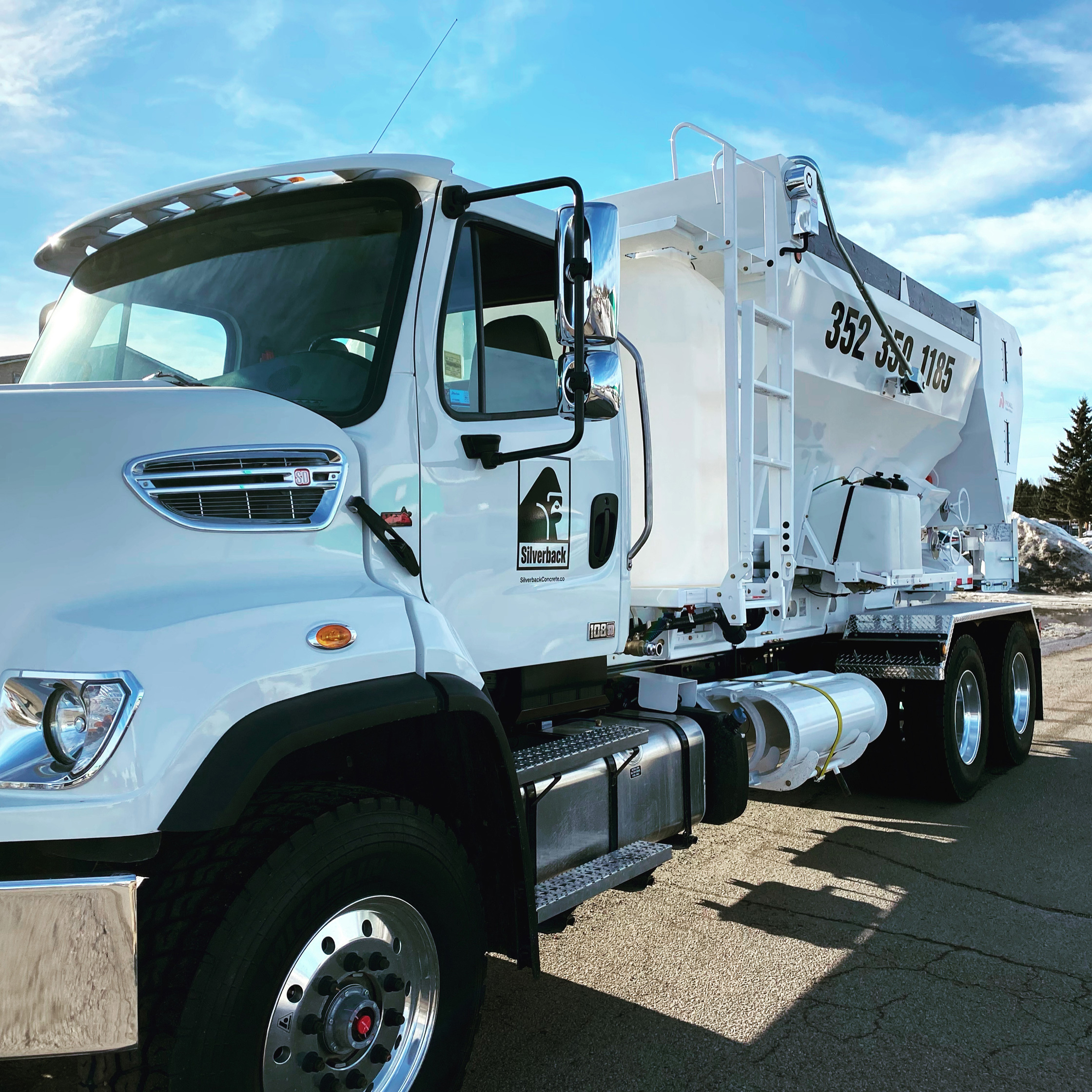
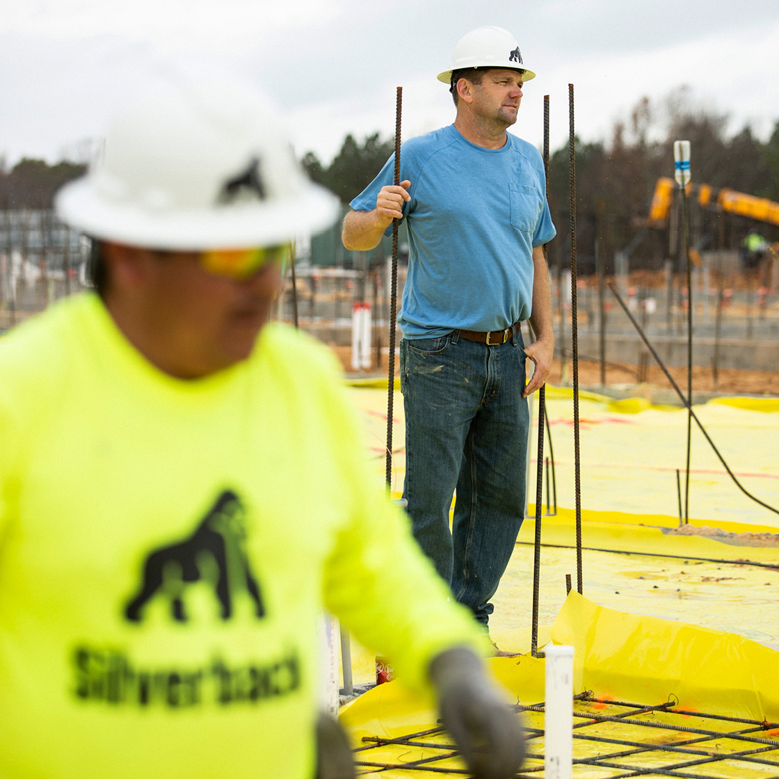
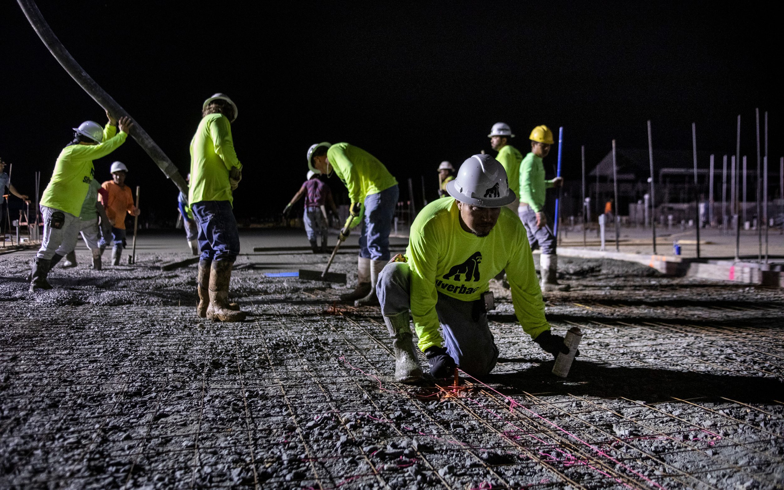
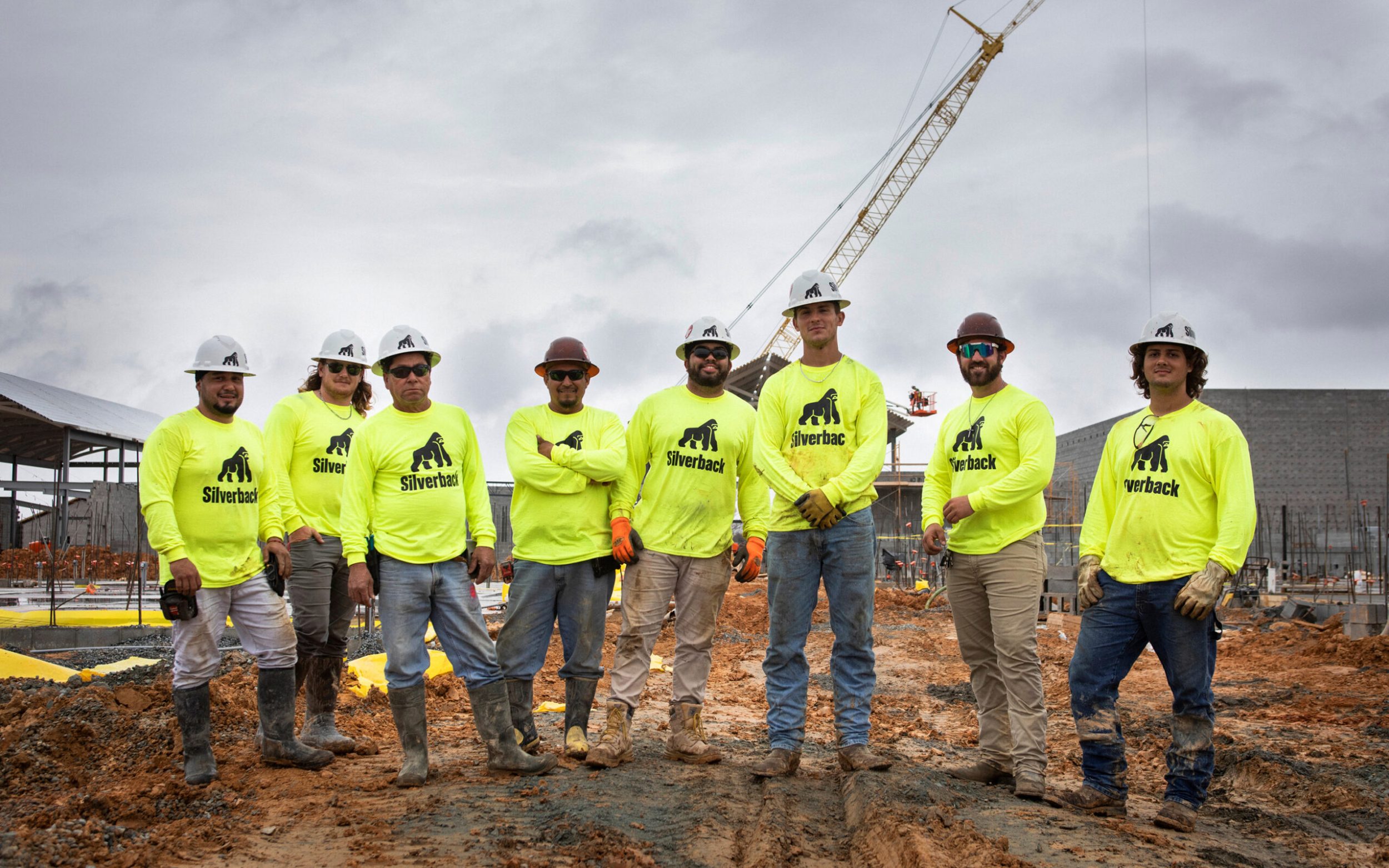
The color palette facilitates structure and neutrality through a near-black cinder gray and several cool concrete shades. Small pops and occasional floods of an almost fluorescent red provide electric intensity and heat. Metallic silver appears in print, livery and signage. And a totally fluorescent green-yellow – the industry standard for safety – ensures that teammates can be seen from outer space.
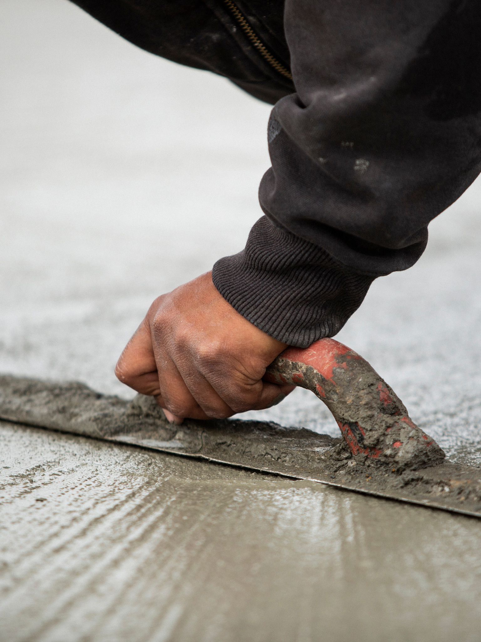
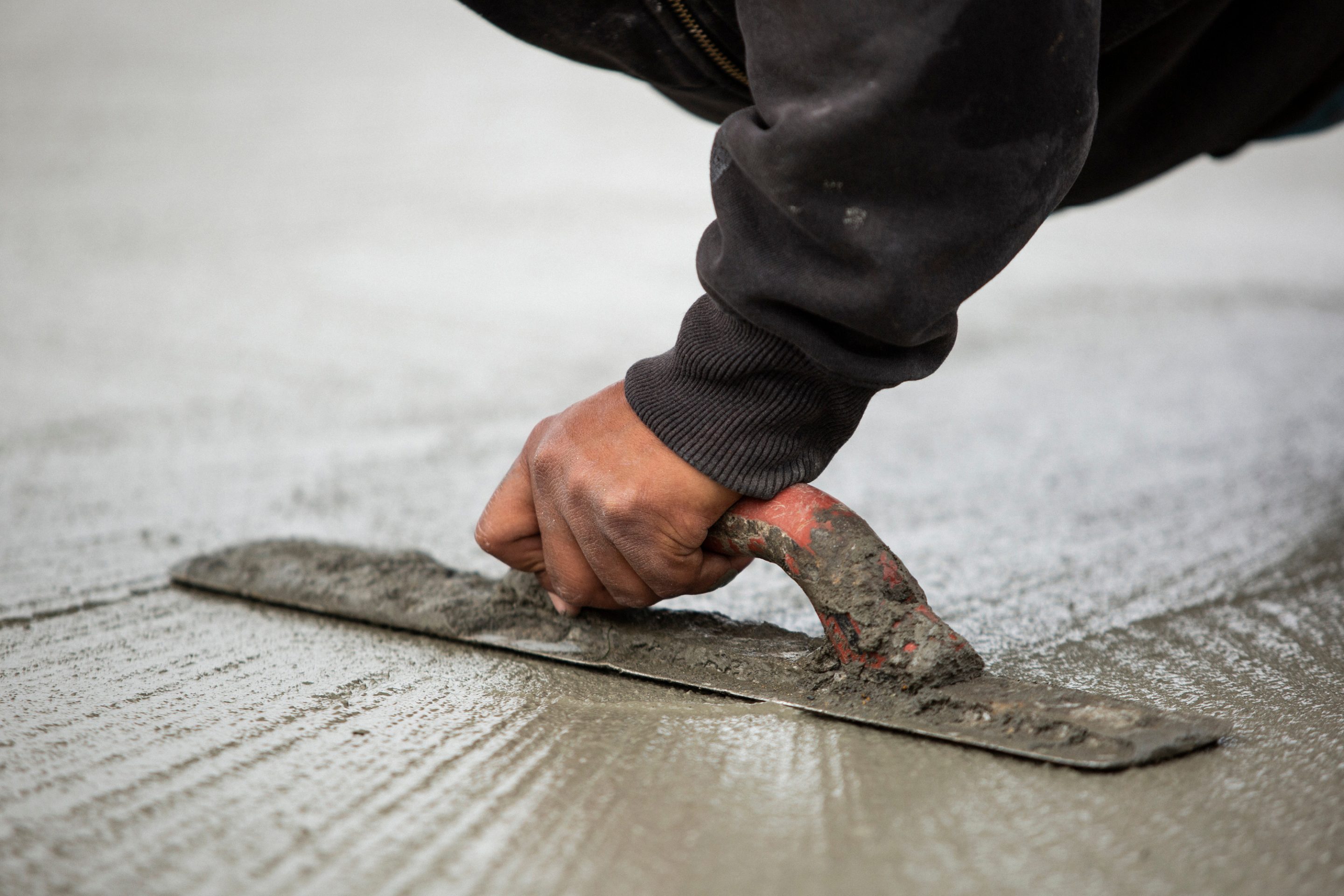
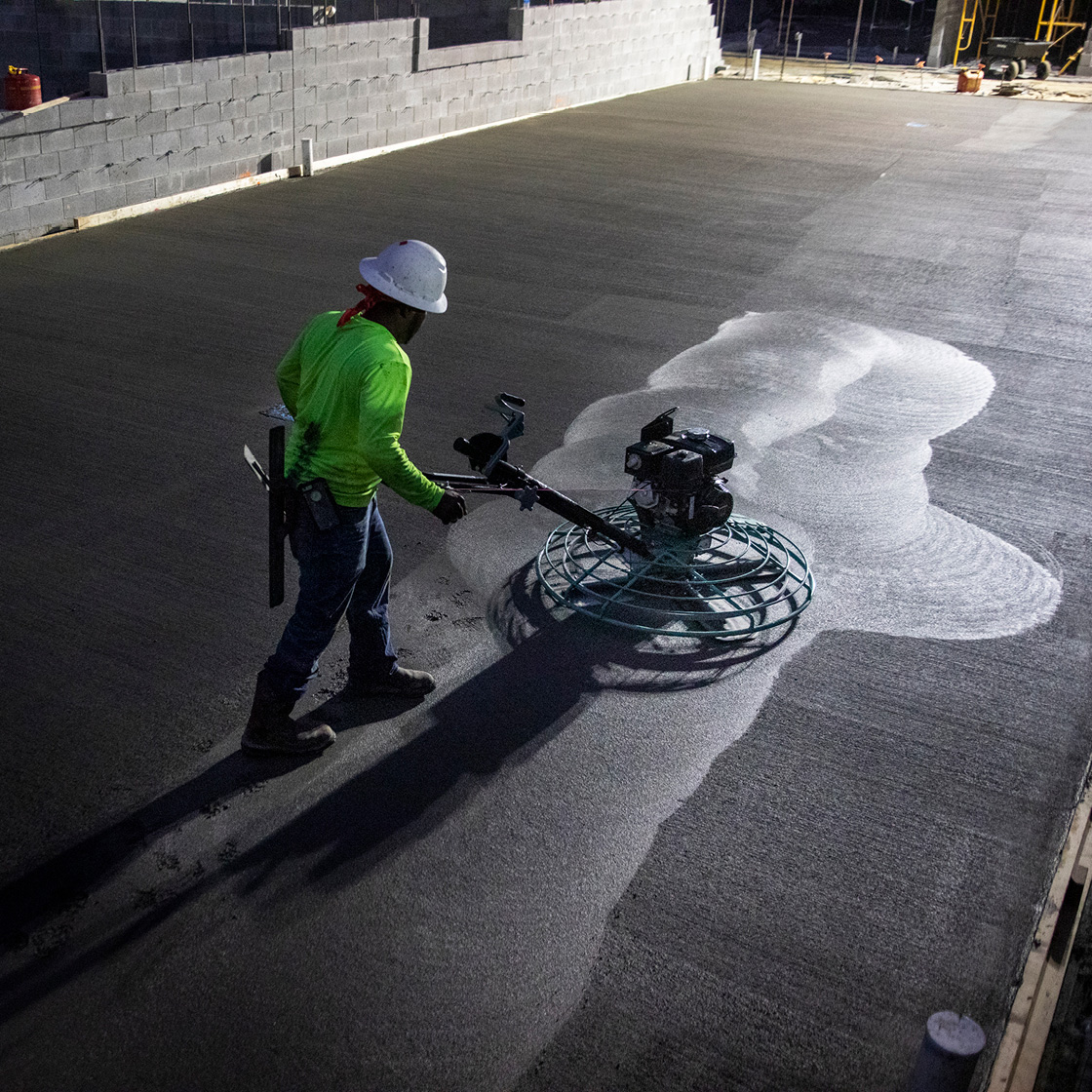
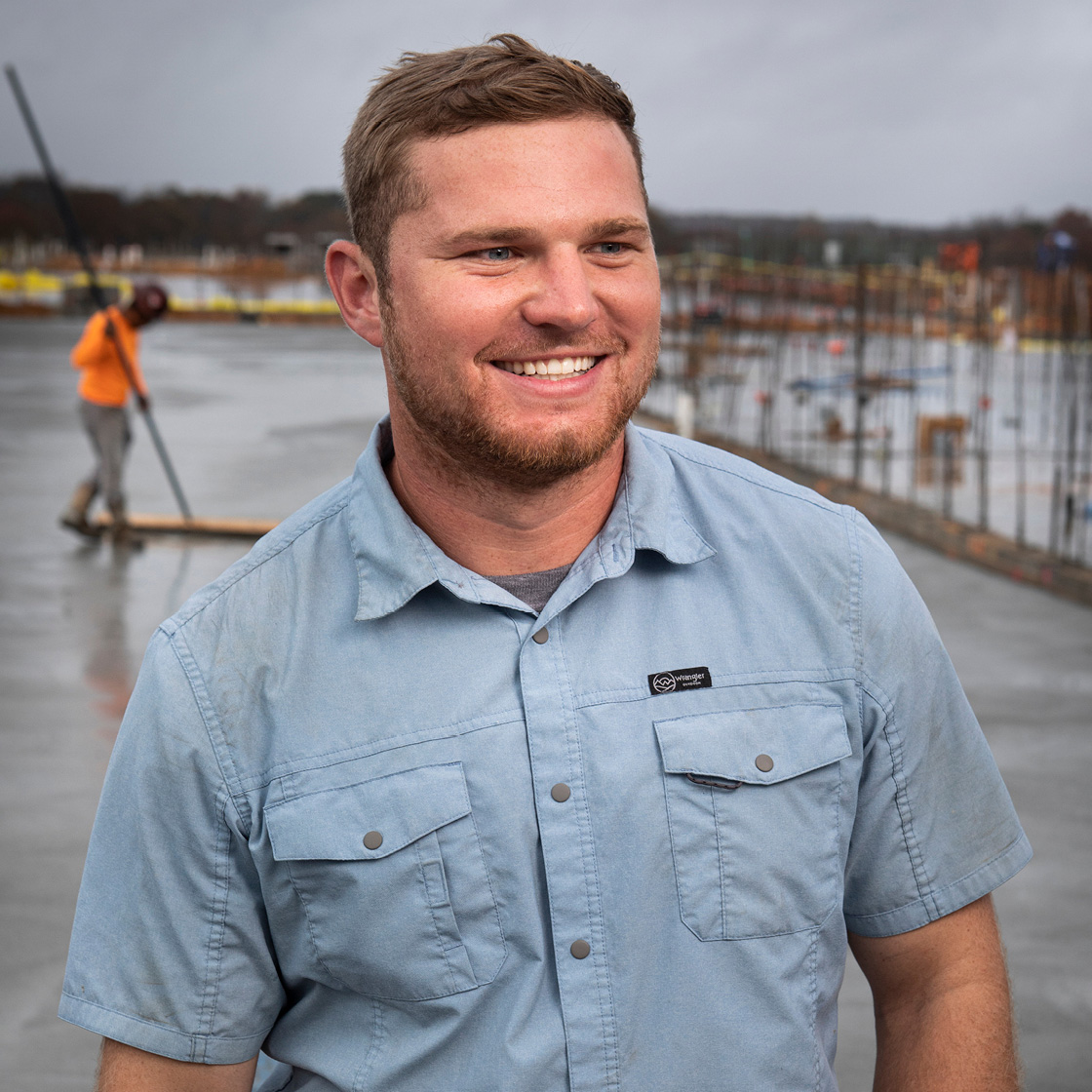
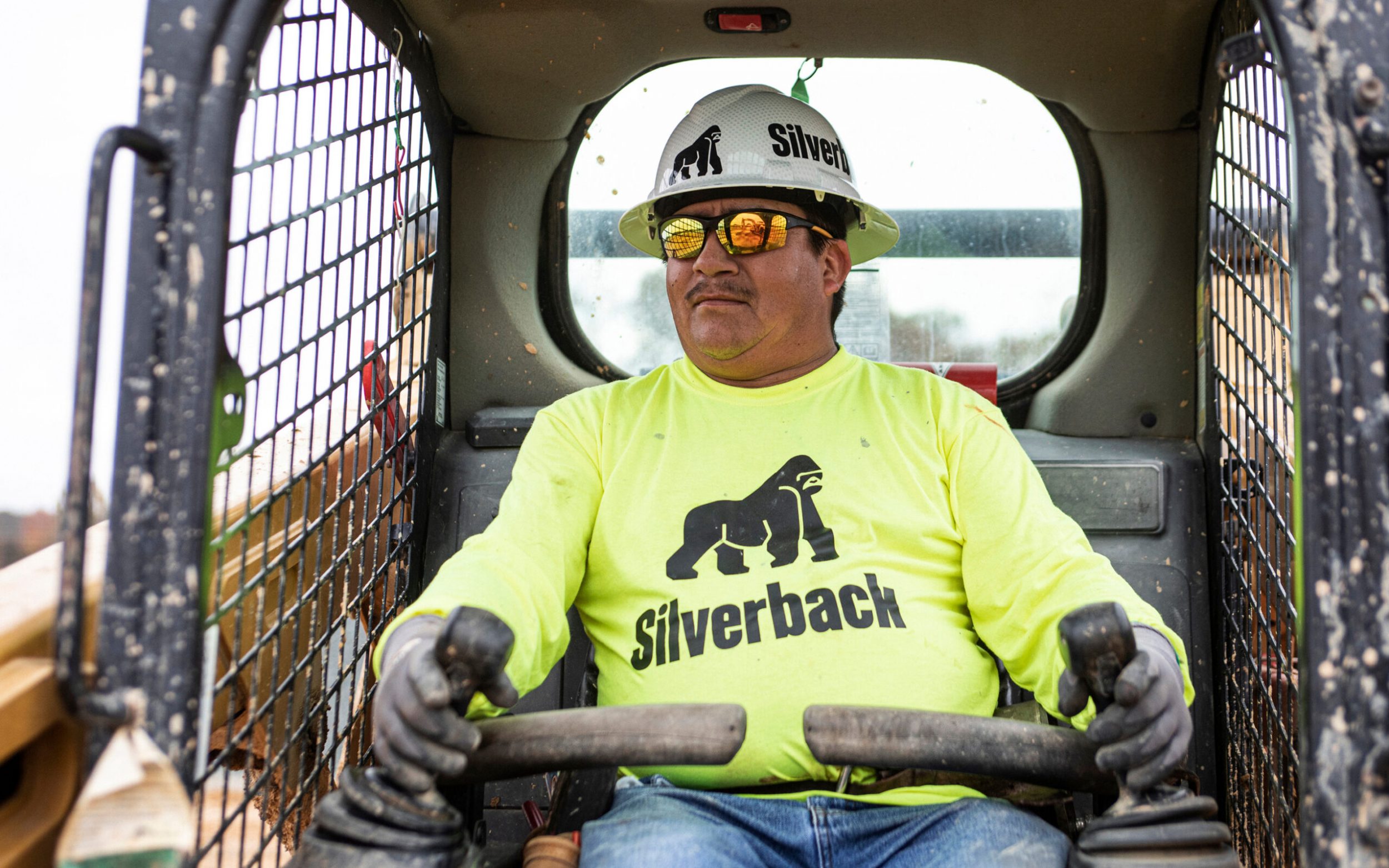
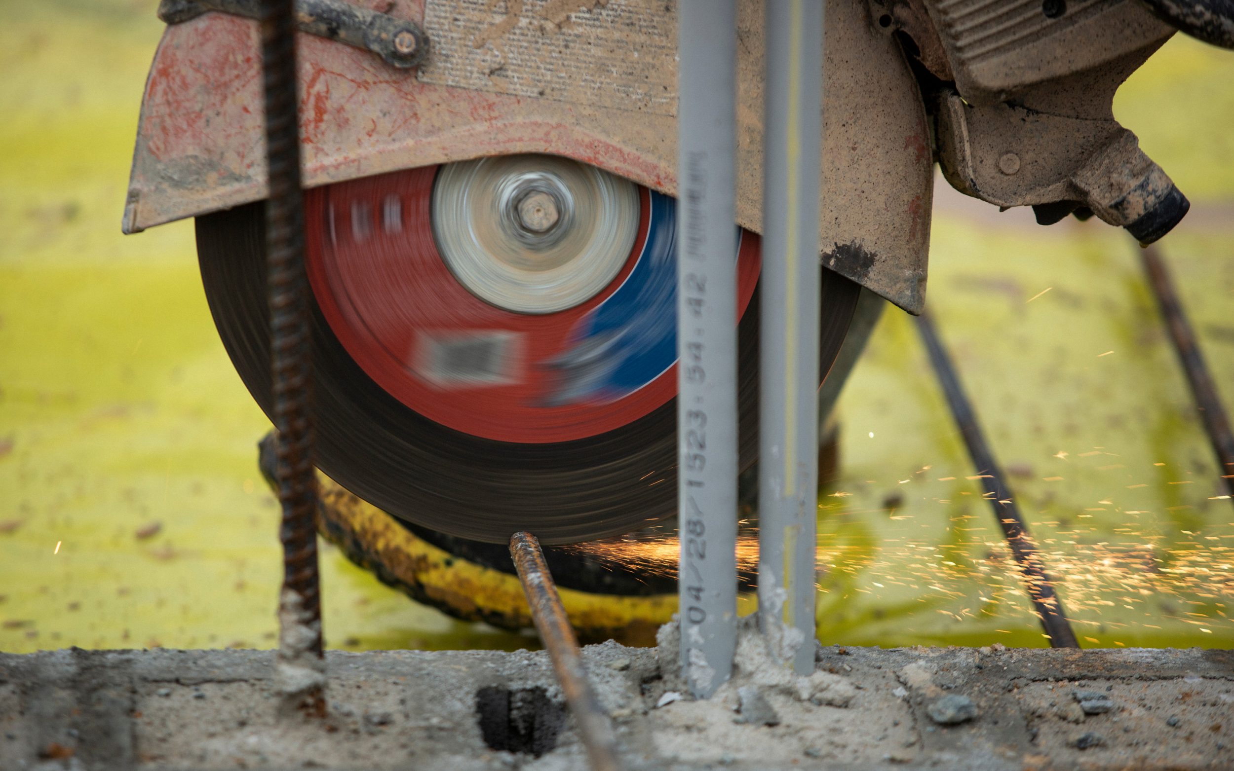
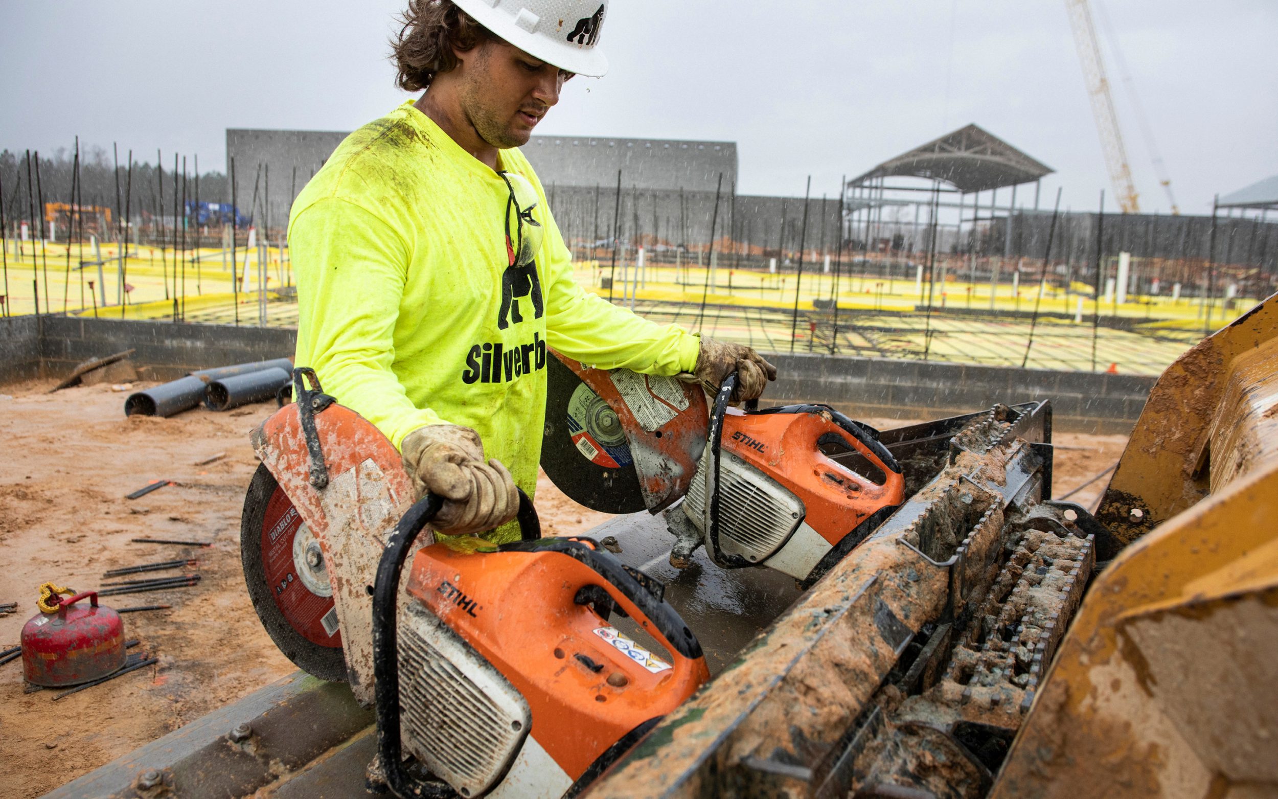
Imagery celebrates precision and grit, grand scale and minute detail. We led a shoot at a 170-acre job site in southern Virginia to set the standard for photography. The shoot provided a unique opportunity to show Silverbackers pouring concrete in the middle of the night and cranking until a storm arrived just before noon – a common scenario when unpredictable weather and unrelenting schedules collide.
Like a good coach, Steel Brothers did the deep research of finding out who we are, how we’re different and what’s really at stake from our client’s perspective. They found a genuine, accessible way to connect our personal beliefs to the concrete we pour. In a field that isn’t exactly known for getting philosophical, this was no easy task. Now, folks take us more seriously in the bidding process. We’ve seen a difference from the name change alone. It’s much easier to market Silverback than Southeastern Concrete. Our message and our visual identity finally reflect who we’ve been all along and why our work matters. In terms of ROI, our revenue has increased fourfold in the three years since we started working with Steel Brothers. A tremendous factor in that growth has been the distinction and traction that our brand generates – even when we’re sleeping. In a word, the work Steel Brothers delivered is powerful.”
Frank Stankunas, President
Website & Launch Mack on the Move
Silverback’s digital presence treats clients as the real heroes. On the homepage, we immediately address every general contractor’s worst nightmare: carelessness. We describe the contractor’s challenges and position Silverback as their concrete expert. Only then do we shift into featured projects and services.
The tone and pace are casual and amiable yet quick and direct for potential clients on the go. Quote requests can be submitted in seconds and from any part of the site. And the experience is comfortable on screens of every size.
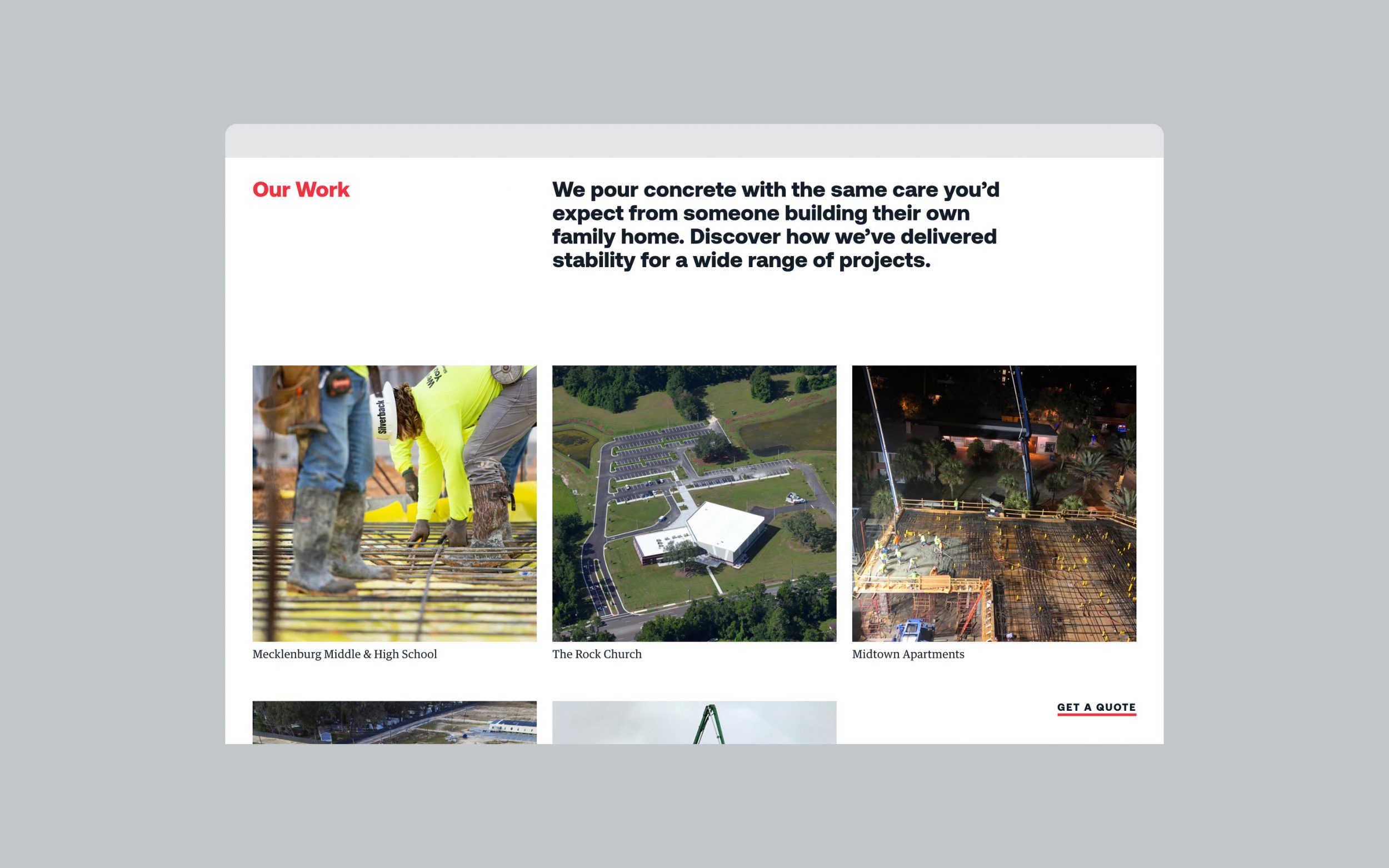
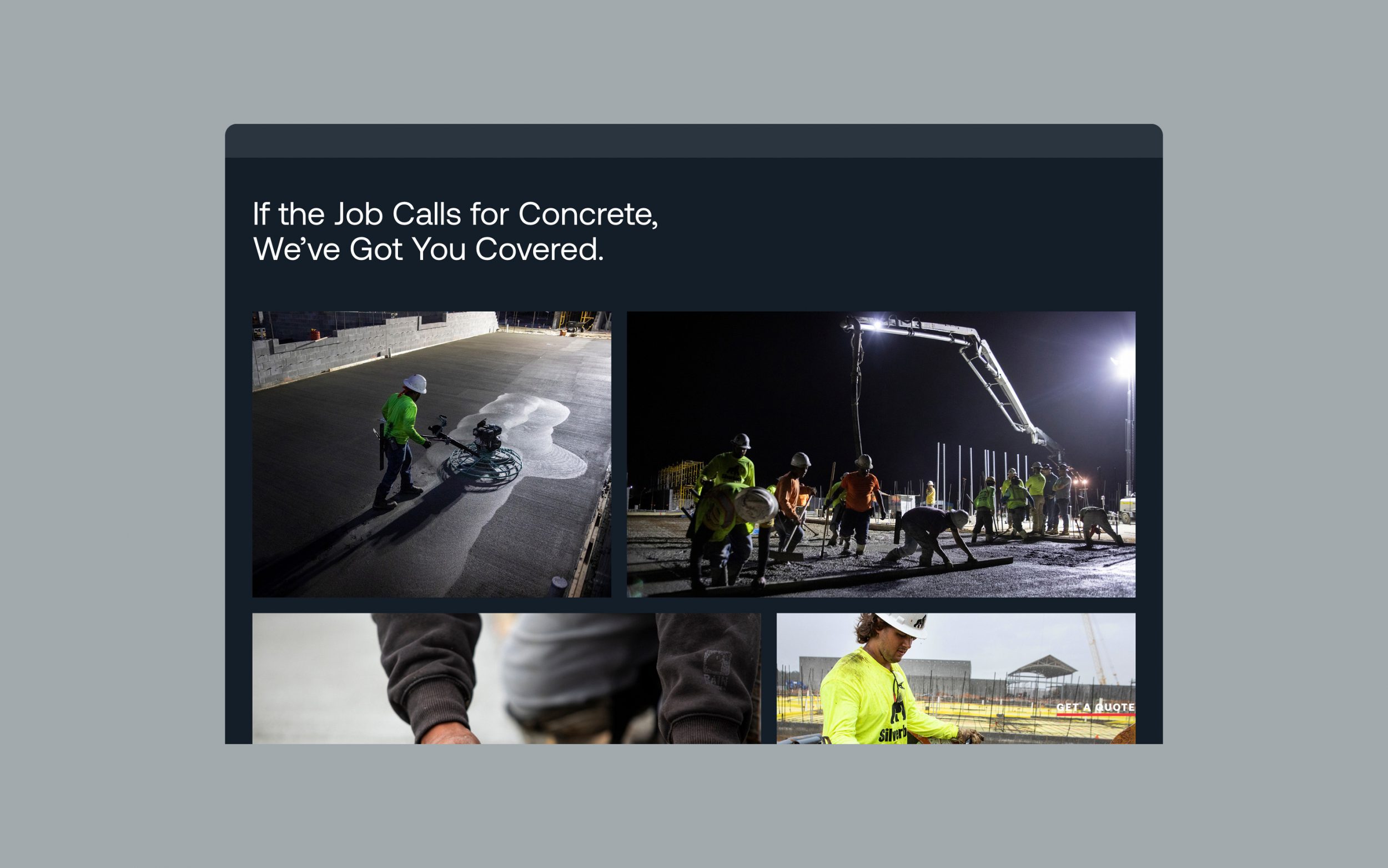
To further set Silverback apart from a sea of drab competitors, we wove in bits of humor and wit where it wouldn’t slow things down. Selected photography balances expansive views and close-ups of work-hardened hands and raw textures. The goal? When people work with Frank and his team, their experience as clients reflects the first digital impression. In other words, what they get is what they’ve seen.
Project pages can start small and grow over time as job sites transform from muddy holes to glazed and landscaped properties. To stay in the know, people can subscribe to Mack Tracks, an occasional email dispatch for project updates, insider tips and more.
While we were jamming on the website, we also designed signage and interior graphics for Silverback’s new building.
We launched Silverback’s new website in January 2021, along with an email blast written as a personal letter from Frank. Within a few days after launch, he received 40 texts and calls congratulating him on the new brand and site. People commended Frank for communicating openly about the faith that grounds him and many of their teammates. As we wrote on their team page, “We built our business on the firmest foundation: the finished work and sustaining presence of Jesus. … We rest in Him, and this makes us indomitable. The promise of perfect peace and the renewal of all things – this is why we work hard and grind every day. It’s only concrete, but we believe today’s sweat builds tomorrow’s kingdom.”