Framing the Tao of Thoreau
How many a man has dated a new era in his life from the reading of a book!”
The New Walden is a self-initiated project which our creative director, Matt, began in 2015. We present this Scenic Route from his perspective. We will presently stop referring to ourselves as if we were Queen Elizabeth. One mustn’t appear to be all mouth and no trousers, don’t you agree? Jolly good.
Have you ever read a book that made you more awake and aware? A book that made you wiser, kinder, more creative? That challenged how you see the world and your purpose in it? In my life thus far, several books have catalyzed turning points. Walden, by Henry David Thoreau, sits near the top of that list.
Thoreau saw that many of his fellow men and women were spending their best moments straining after far more than they needed chasing after possessions and comforts that would never satisfy their deepest longings. He discovered that when we reject greed, simplify our lives, and pursue living in the present, a quiet revolution takes place inside the spirit and ripples outward.
Today, Walden is more relevant than ever, but the book’s readership is declining. I’d like to change that.
I’m creating a newly annotated, hardcover edition that I hope will play at least some small part in solving this problem.
Read on to learn about this project, or head to our online store to buy your copy today.
Scope Creative Direction Art Direction Design Campaign Strategy Copywriting Editing
Contributors Co-editor: Corinne H. Smith Kickstarter Campaign: Daly Video: Hannah Radcliff & Edward Calvey Score: Ariadne & Bryan Steel
In this Case Study
Background You’re Doing It Wrong
In the first chapter of Walden, Thoreau delivered an eloquent and scathing criticism of consumerism. He saw that many of his fellow men and women were spending their best moments chasing after possessions and comforts that would never satisfy their deepest longings. He discovered that when we reject greed, simplify our lives and pursue living in the present, a quiet revolution takes place inside the spirit and ripples outward into the lives of others.
I first read Walden in 2014, not in print but on a tablet. Slogging through the Project Gutenberg version on an iPad is probably the worst way to read a story about simplicity and disconnection from noise and competition. It was an error-riddled, default reading experience on a device made for multitasking and connectivity. I could hear Henry grumbling from his grave: “You’re doing it wrong.”
I set out to find an attractive, archival edition to keep near my other essential books. Surprisingly, only two (both very rare and out of print) came close to mirroring Thoreau’s voice and values. Granted, this was my subjective opinion. But as a designer and a lifelong word nerd, I’ve learned a few things about how books want to look.
A well-designed book is like a suit made to order. It fits your body just so. Loose where you need mobility, trim where you don’t. It fits your context and time but isn’t limited by passing fads. The tailor can’t help but bring their own point of view to the suit, but they know the product isn’t for them. It’s a careful balance of comfort, beauty and function. It’s custom, made for your needs, your taste and no one else’s.
Any book that rises above self-absorption does so because it’s written and designed for the reader, not the author or designer. So the tailoring is about authenticity and expectations. Beyond the basic principle of readability, a book should accurately represent the story so the audience isn’t led astray. Faithful representation should begin at the cover and carry through to the colophon. Unfortunately, most publishers are content with flashy covers and mind-numbingly mediocre interiors. They’re in business for the bottom line, not for you. A visit to any physical bookstore, if you can still find one, confirms this fact.
I thought that with time and elbow grease, I could create a beautiful, faithful and durable Walden that bibliophiles and design-lovers alike would treasure.
My original plan was to fund this project through a Kickstarter campaign in early 2016. I hired a brilliant team of fundraisers, but despite an intense PR and marketing campaign we fell short of the fundraising goal. Kickstarters are all or nothing, which means I walked away empty-handed. Nevertheless, I learned valuable lessons and discovered an enthusiastic audience for this book. The pledges we received would’ve paid for about 500 books: halfway to 1,000, a respectable number for a limited edition. With a reduction in costs and a different funding method, a smaller print run became possible. Keep reading to find out how.
Despite a small budget, some wonky audio and several aspects that have evolved over time, our 2016 campaign video still captures the essence and purpose of this project.
What Makes It New? Notes, Pacing & Art
Annotated editions of Walden already exist, some of which include abundant commentary. That’s great for academic study, but a delightful reading experience for both newcomers and longtime fans is my primary goal.
I’ve found the perfect co-editor in Corinne H. Smith. Corinne is a seasoned writer, a published author and poet and a longtime member of the Thoreau Society. She’s written two books on Thoreau: Henry David Thoreau for Kids and Westward I Go Free: Tracing Thoreau’s Last Journey. We first crossed paths in 2015 when she interviewed me about the new Walden for the Thoreau Farm Blog. We immediately bonded over our shared affinity for Thoreau and the great outdoors.
Our annotations are relatively sparse. We don’t want to create a study companion as much as an unobtrusive guide. The goal is to leave you alone with the text as much as possible but to provide enough insight so that you can keep your smartphone in your pocket.
Corinne H. Smith, in her element
Some annotated books use footnotes or endnotes, which can be tedious and fussy, forcing the reader to hunt for references. Superscripts or subscripts clutter the page and distract the reader. Even the editions of Walden with friendlier side margins are tough to follow after several pages because the main text and notes become separated.
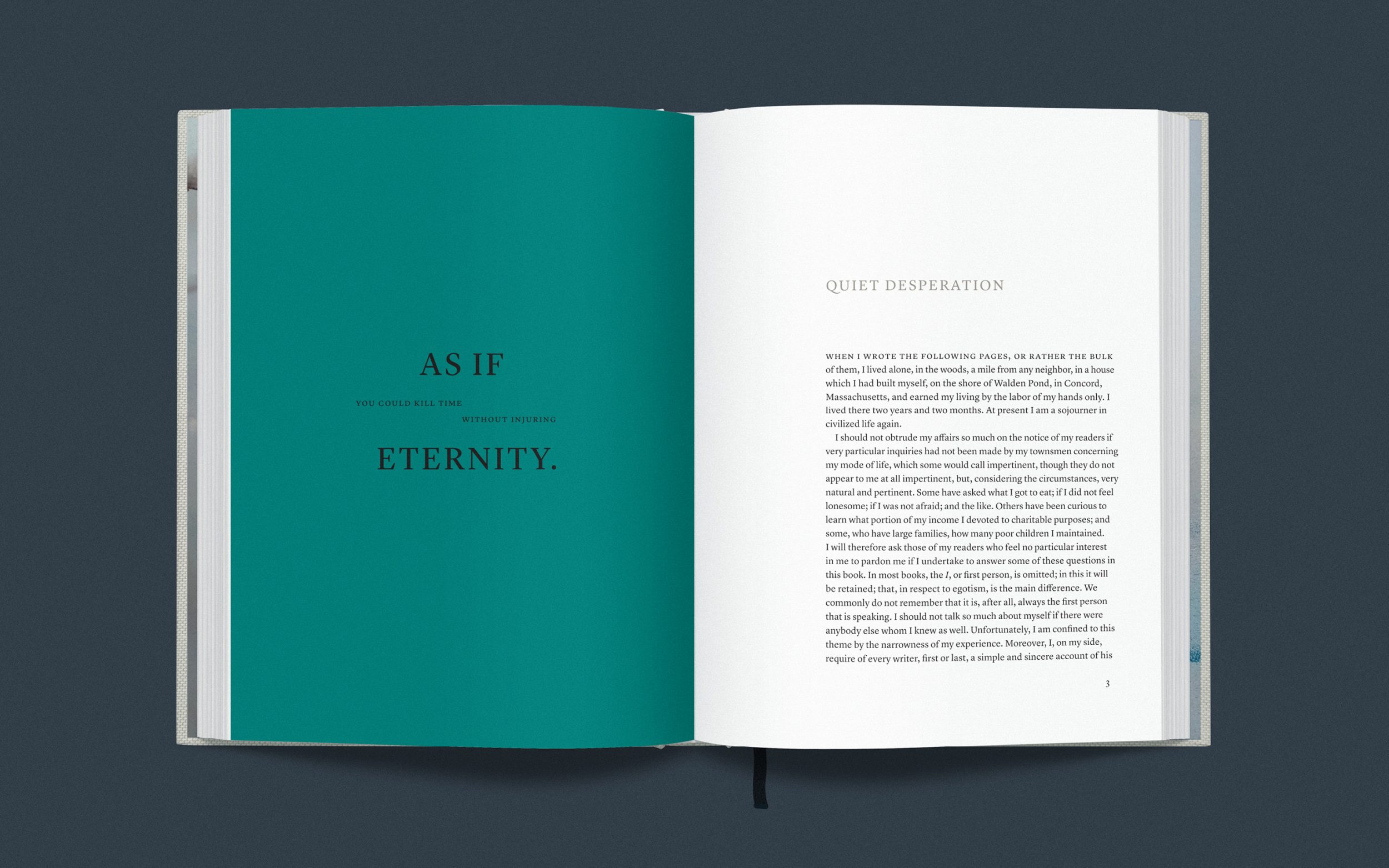
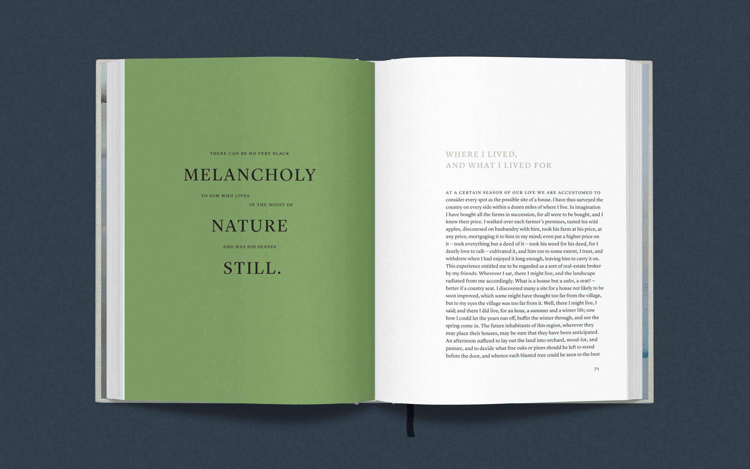
Instead, our notes are set off in the margins, right next to the lines they elucidate. Not only are such notes easy to find when you want them, but they enhance the page’s aesthetic, ruffling like little prayer flags in the wind.
Additionally, we’ve updated the structure of Walden – but not in a way that changes the content. Thoreau loosely arranged the book to follow the progression of seasons throughout the year, so we simply created four sections of similar length and gave each section its own title and opening spread.
Economy, the book’s first chapter, is by far the longest, comprising nearly 25% of the entire text. I’ve turned Economy into book one by breaking it into six shorter chapters and left the other 17 chapter arrangements alone. This yields 23 chapters of similar length. The content is presented in the same order as the original text, but the new structure creates a more sustainable pace and a better rhythm.
Finally, there are two ingredients that don’t exist in previous editions: full-color illustrations, and a section of prose poems selected from some of the book’s most arresting sentences.
Typography & Structure Quiet Workhorses
Typography is the life-blood of this book’s design. An effortless reading experience and timeless aesthetics were of utmost importance. After extensive research and testing, I decided against fonts based on those from Thoreau’s day. Most felt too stiff or too ornate for this project.
Walden is an occasionally volatile mixture of wildness and restraint, much like Thoreau’s French Huguenot ancestors. I wanted something with a bit of sparkle that would also be practical and space-efficient. Lyrical but not flashy.
I found an ideal solution in the Lyon type collection, designed by Kai Bernau for Commercial Type in 2009. A “contemporary interpretation of [Frenchman] Robert Granjon’s seminal serif typefaces from the 16th century,” Lyon’s optical variations and weight range mean I can use a single font family for everything from cover to marginalia. There are even two Regular weights, one a tad lighter or more “blond” as type designers say. The lighter weight works perfectly for paragraphs. Our annotations, smaller and printed in a spot gray color, hold legibility and textural evenness thanks to the marginally thicker Regular No. 2.
Instead of the typical justified text block, ours is ragged on the right, which is the most natural approach for rightward-reading languages like English. Ragged setting makes it easier to achieve consistent white space in and between words, and reduces eye fatigue. The aesthetic result is organic, a typographic deckle that breathes.

A book about living simply in nature deserves organic proportions. I wanted a harmonious tension between the page shape and the text column. After testing several page shapes and layouts, I settled on a short pentagon – a proportion found in living things from roses to starfish. This makes for a relatively wide page, giving room for body and annotations to comfortably coexist. An asymmetric layout makes the words feel as if they’re about to walk off the page and around the bend.

Smyth-sewn books typically have flat spines, which can feel almost like holding a clamshell open with the clam still inside. We’re using a rounded European spine that naturally fans out and lays flat when open. This allows greater layout freedom since the gutter is more of a gentle valley than a steep ravine. Easier to hold with one hand. And over time, the rounded spine puts far less stress on the binding. In other words, this detail makes the difference between a shelf-life of decades and centuries.
Thoreau was an early advocate for conservation, and sustainability is critical to this project. From cloth and thread to paper and ink, all of this edition’s materials will be high-quality, archival, durable and responsibly made. And we’re partnering with a printing company that uses 100% renewable energy.
“Economy,” by Brooks Salzwedel, was the aesthetic centerpiece of our Kickstarter campaign.
Illustration Library Punk
Full-color, custom illustration has always topped the features list for the New Walden. Like other aspects, the approach has evolved over the years.
My initial plan was to work with the artist Brooks Salzwedel. In his own words, his work depicts “natural and unnatural landscapes disconnected from their usual surroundings or places in time.” The effect is by turns ominous and transcendent.
Brooks made the first of several illustrations for our Kickstarter campaign in 2016. When I resumed work in 2018, he was thrilled to hear I hadn’t given up. I scribbled down a stack of ideas which we narrowed and refined together. So far, so good.
But then, I learned that Brooks was battling serious health issues. In order to focus on treatment and a long, painful recovery, he needed to cease all professional artwork for the foreseeable future.
Whether you’re an artist or not, I’m sure you know one or two. Can you imagine what such a decision would do to your spirit? I can, and my heart broke for Brooks.
Needless to say, this introduced a major hurdle for the New Walden. It didn’t feel right to ask someone else to ape Brooks’s style. I searched high and low for months but couldn’t find a suitable alternative.
One Saturday morning, I was sipping coffee and watching a breeze stir moss-ridden branches in our backyard. I thought, The hell with waiting for other people. I didn’t go to art school for nothing.
Shortly after moving to Florida in 2016, I began to develop a collage-based illustration style. I’ll gather photos and drawings from open-source archives and combine them with vector artwork to create figurative scenes and semi-abstract vignettes.
I realized this library-punk approach made sense for Walden. Thoreau was a scavenger, too. He used reclaimed boards and nails to build his cabin. I think the scrappy thrift of collage would resonate with Thoreau if he was alive today.
A second breakthrough came after a conversation with my friend Whitney Winkler, an artist who specializes in watercolor and ink works on paper. She graciously offered to donate several images for endpapers and liquid textures in my illustrations.
So. Back to the actual drawing board.
If you have built castles in the air, your work need not be lost; that is where they should be. Now put the foundations under them.”
Thoreau
Economy. In this original first chapter, Thoreau writes at length about the “vital heat” or life force within us and what it actually takes to maintain life and limb. I couldn’t find a suitable old-fangled picture of Walden Pond, so I made my own from disparate parts. Thoreau maintained his own vital heat through several trades; in addition to writing he was a surveyor – hence the topographic drawing in the sky and the handwriting in the forest. The handwriting here is Thoreau’s.
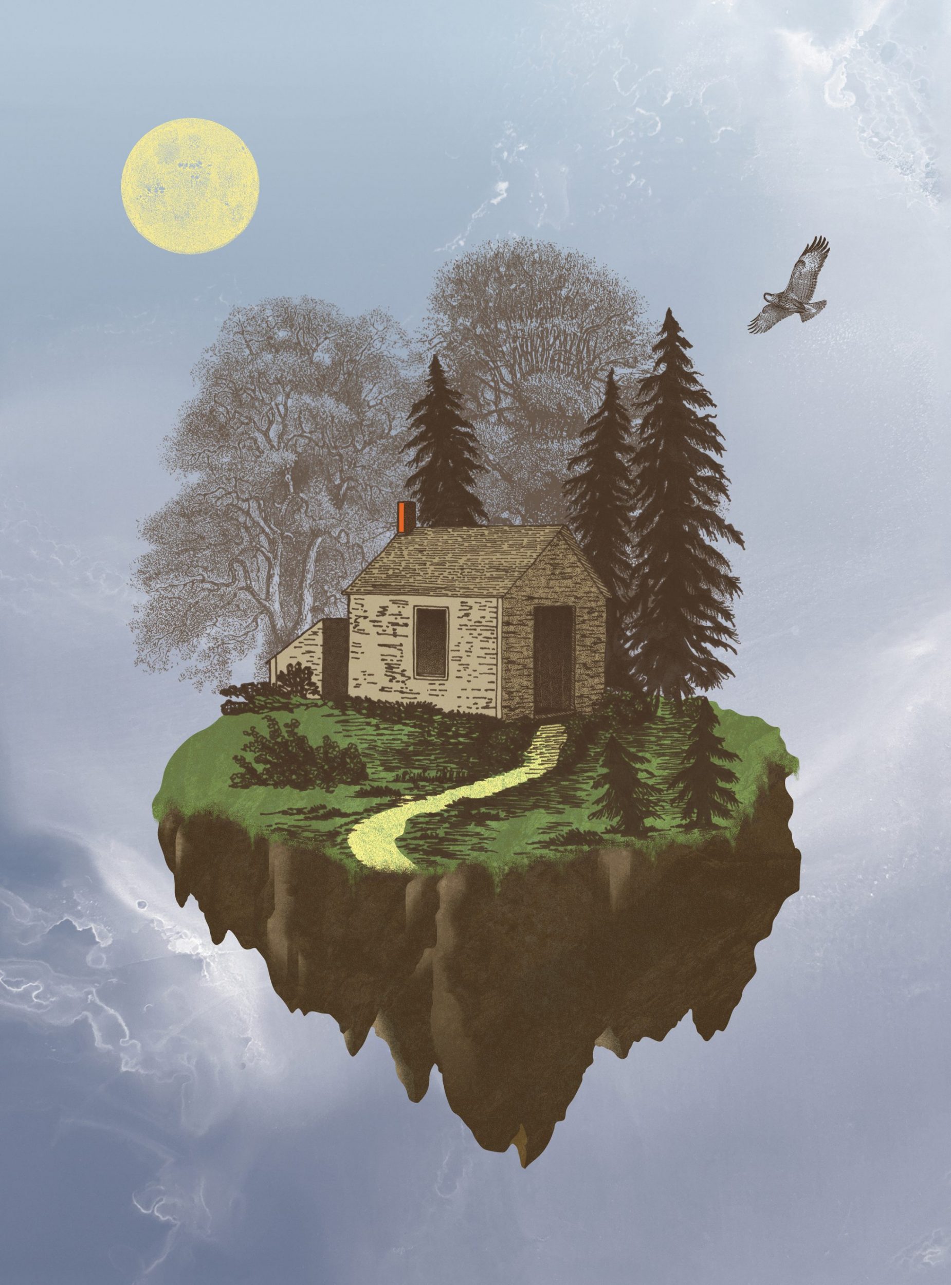
Living. In the original 1854 edition, the only image is an ink drawing of the cabin by Thoreau’s sister Sophia. A revamp of the original drawing seemed sensible for the second book, but elevated – a “castle in the air” – as if a giant had scooped up Thoreau’s little plot in the woods and set it afloat in the sky. I couldn’t find a high-resolution image of the original drawing, so I carefully traced the original, making a few subtle improvements along the way. Swipe to see the original.
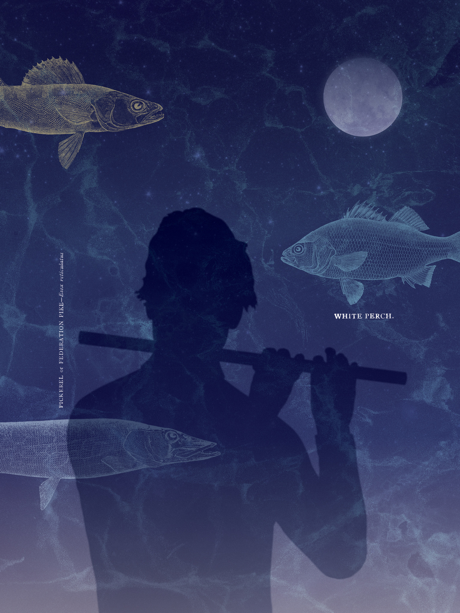
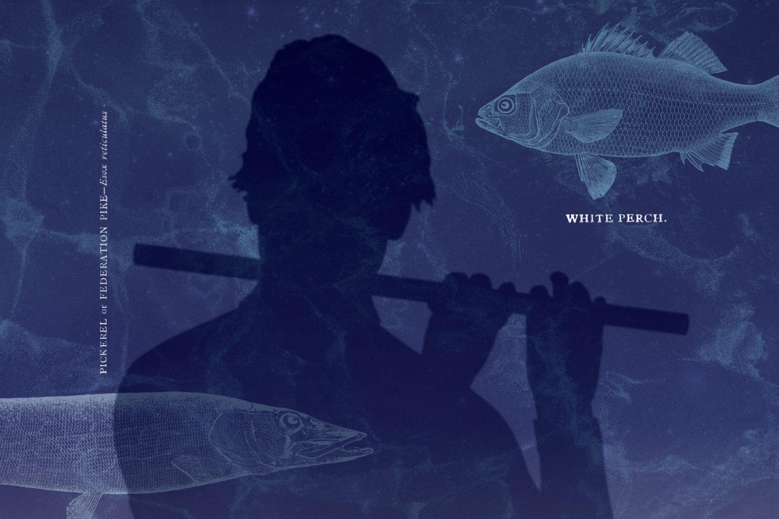
Neighbors. In the third section, Thoreau describes the people, creatures and scenery that kept him company. “In warm evenings I frequently … [played] the flute, and saw the perch, which I seem to have charmed, hovering around me, and the moon travelling over the ribbed bottom…”
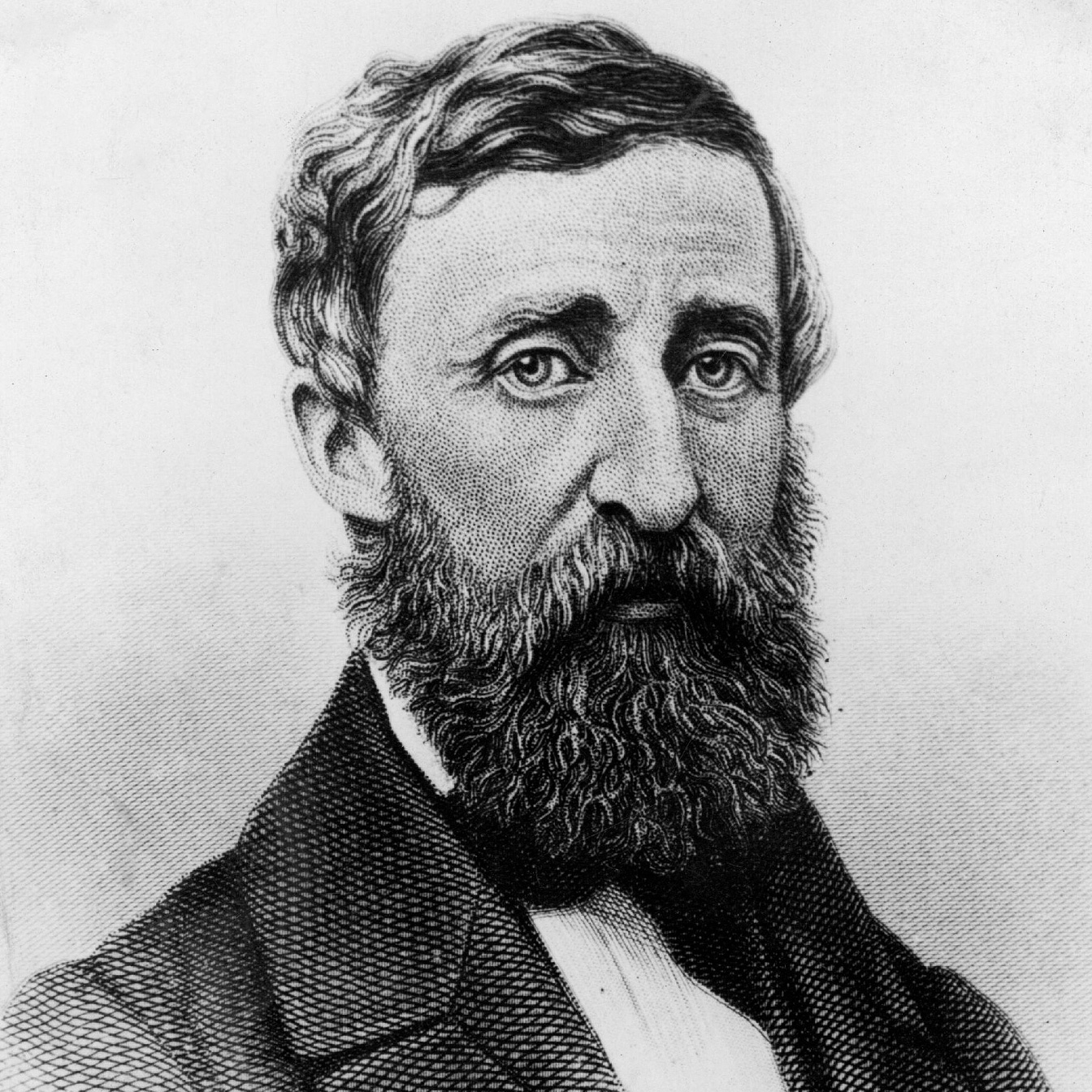
Dawn. Walden ends with a burst of light: “The light which puts out our eyes is darkness to us. Only that day dawns to which we are awake. There is more day to dawn. The sun is but a morning star.” At the beginning of our last section, an older Thoreau – based on Dunshee’s 1861 ambrotype taken some 14 years after he moved away from the Pond – floats atop the same sky-island from “Living.” Sunrise glows within him.


Whitney Winkler’s ink washes are subtly woven throughout the illustrations. The first one shown here will be used for endpapers.
Prose Poems Choice Relics
Thoreau was a poet, but his best poetry was hidden in his prose. This edition features a curated selection of Walden’s most lyrical passages, presented as prose poems and arranged by theme – 23 themes, all told, ranging from appreciation and awakening to living in nature, local wilderness, simplicity, solitude and more. By setting these selections in prose form rather than lineated verse, we can maintain the original format while highlighting each passage’s aesthetic. And just as the main text walks through the seasons, pale background tints gradually cross the color spectrum as you turn from spread to spread.
After more than seven years in the making, this edition of Thoreau’s beloved masterpiece is finished and ready for your enjoyment.
If you’ve read this far, you must really be interested in buying The New Walden for yourself or a fellow bibliophile.
Wait no more! Head over to our online store to secure your copy today.
P.S. You may notice several aesthetic differences between the images shown here and the newer renderings in our store. We’ll update this page once we’ve taken photos of the final product. We do have a studio to run, after all! #priorities