Navigating Today’s News
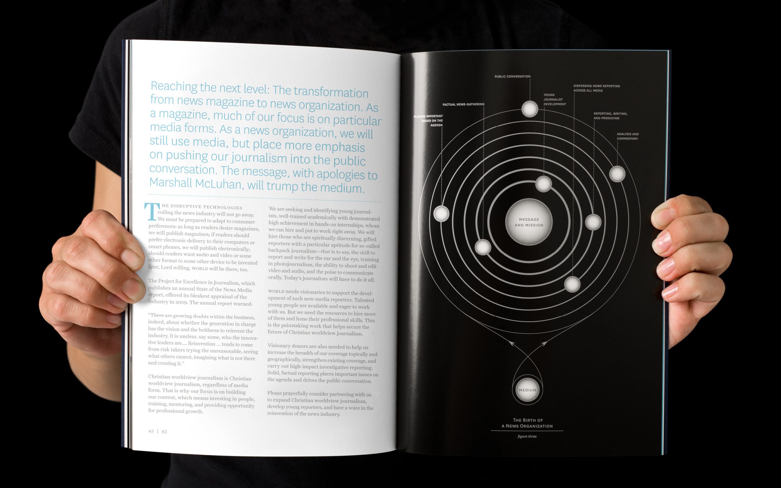
In 2009, a new vision was percolating at World News Group: to grow from a medium-centric magazine to a message-centric news organization that pushed journalism into the public conversation.
To bring this vision to life, they needed to raise capital and clarify their 501c3 status as a nonprofit. WNG approached us to help them design a promotional tool that would empower their business development team and spur potential donors into action.
The Blue Book, as WNG’s team took to calling it, became the catalyst for redesigning the organization’s brand identity as well as its flagship publication, World Magazine. Over the course of three years, we worked with WNG on a wide range of projects from visual identity to fundraising collateral, media guides, direct mail campaigns and an iPad app. The work you’re about to see is only the tip of the iceberg.
Scope Creative Direction Copyediting Copywriting Design Illustration
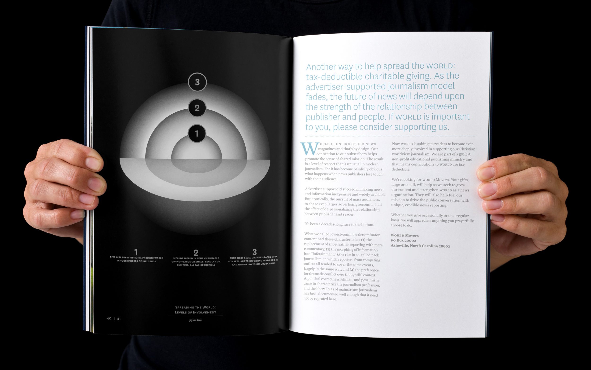
Spreading the World
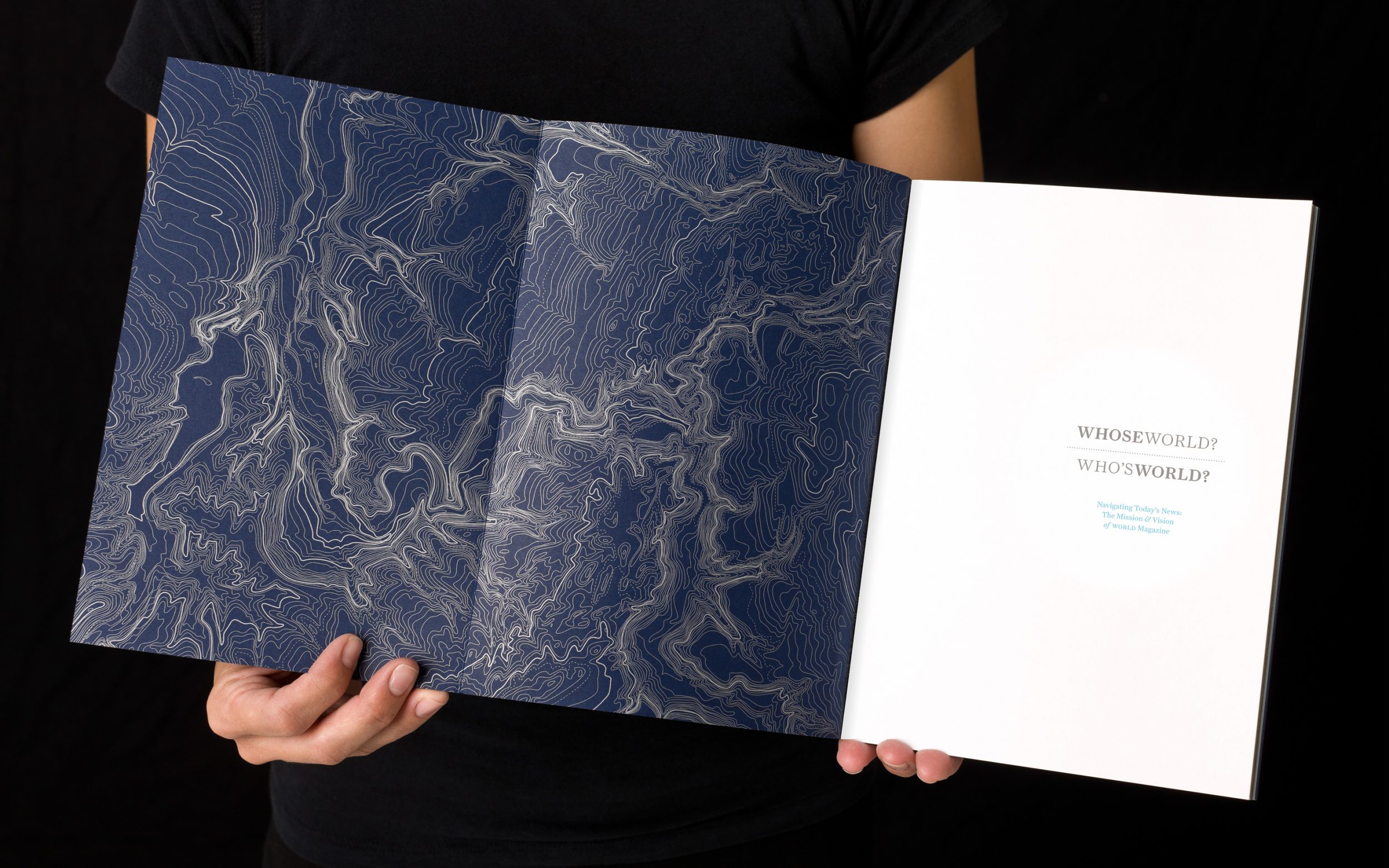
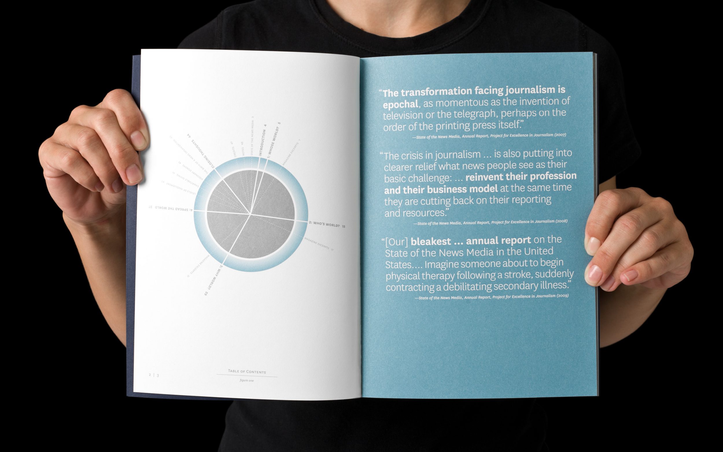
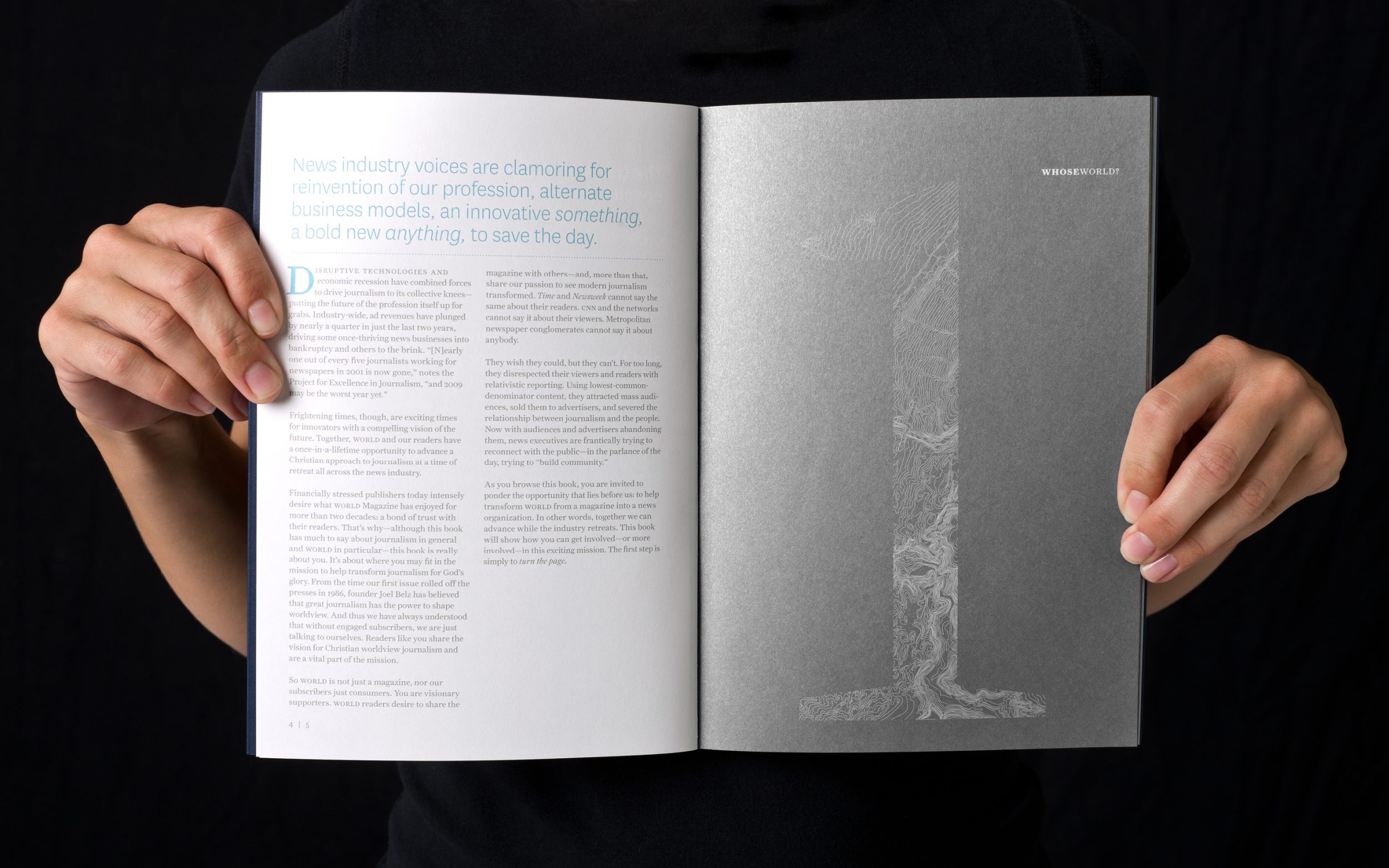
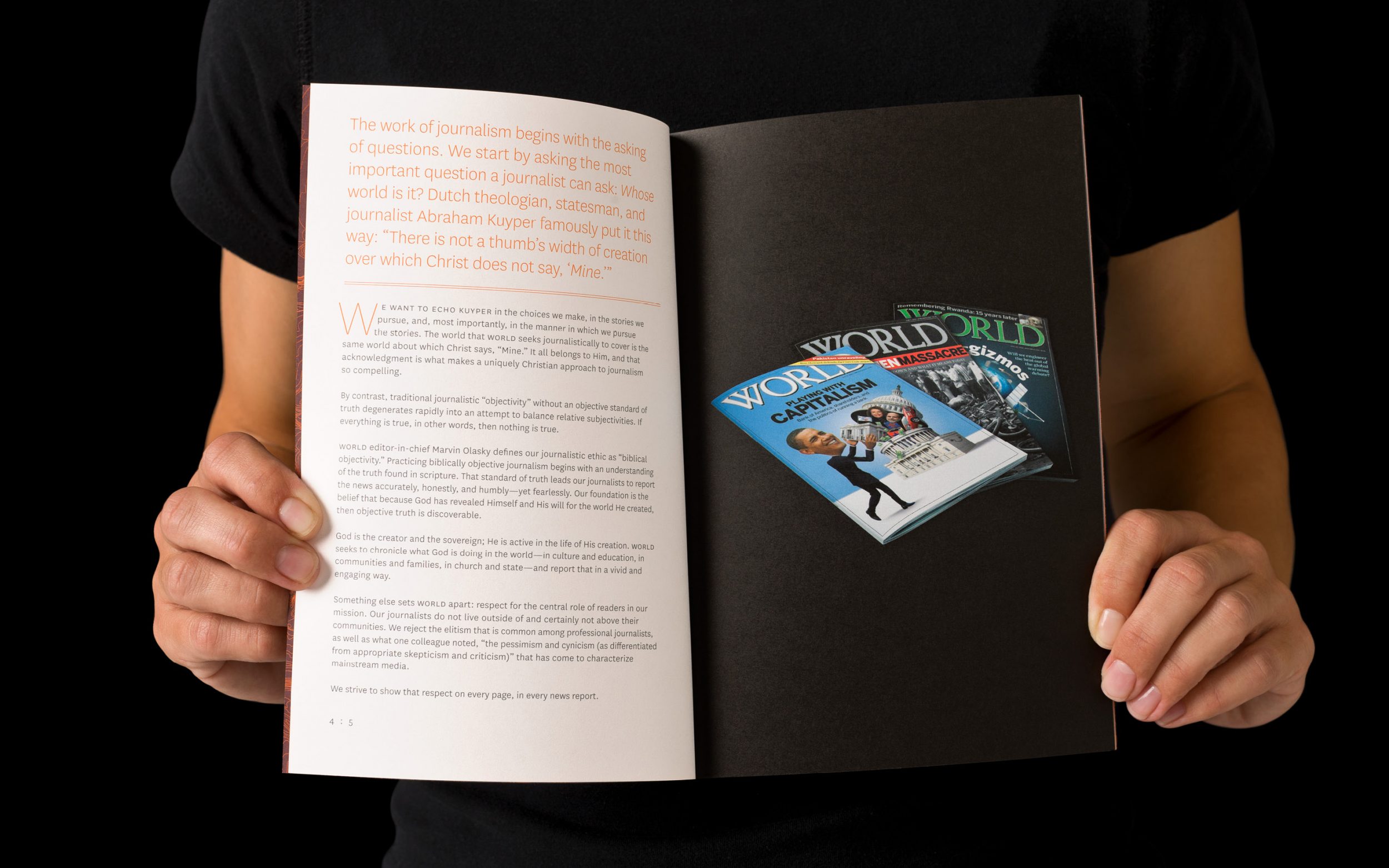
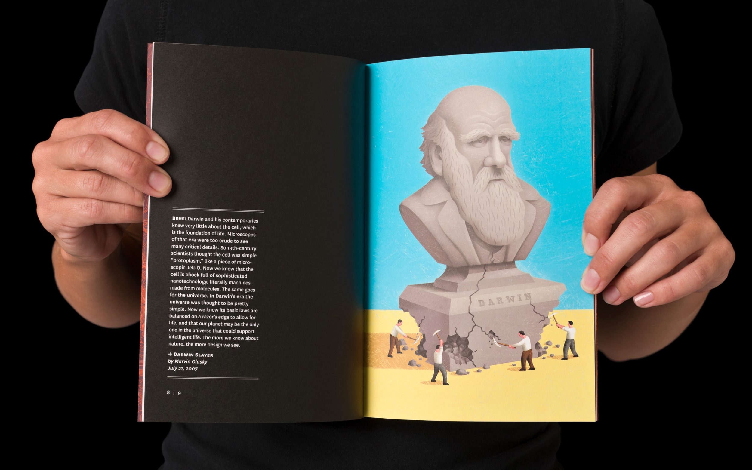
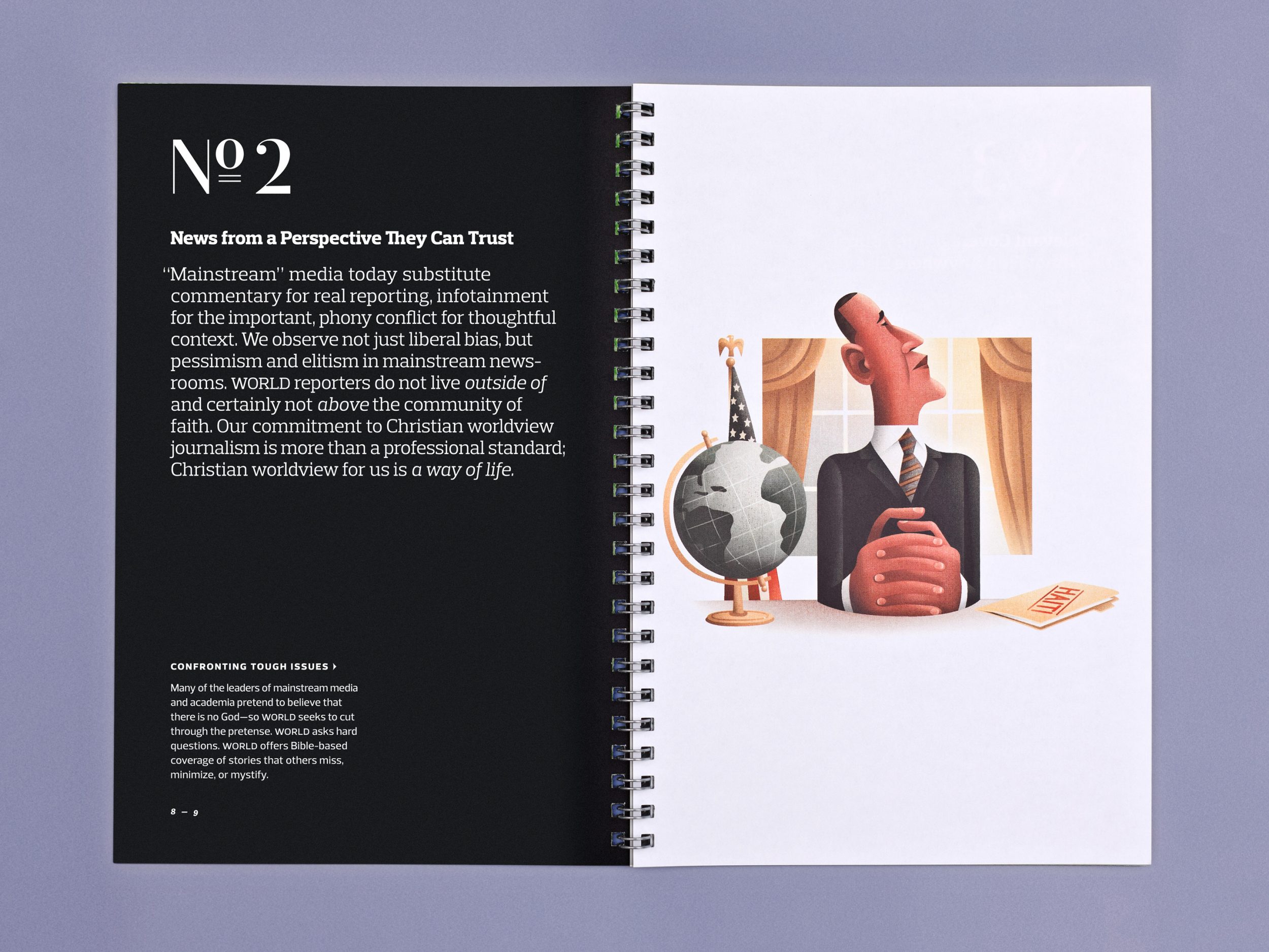
The booklet’s content follows two tracks. The first, printed on vellum uncoated paper, is a series of short essays written by Nick Eicher, WNG’s Chief Content Officer. Nick penned a hero’s journey of sorts, beginning with the news industry’s struggles and closing with a new vision for the future. To capture a donor’s attention, we needed to paint the pain. As he wrote in the first part, “News industry voices are clamoring for the reinvention of our profession, alternate business models, an innovative something, a bold new anything, to save the day.” The second track, printed on sumptuous glossy paper, offers a carefully curated glimpse into World’s best reportage and insights over the past decade.
A visual theme of navigation runs throughout. This theme subtly reinforces the fact that WNG needed to secure its place in 21st-century journalism by looking beyond its immediate, medium-centered environment – looking up and outside of the known world.
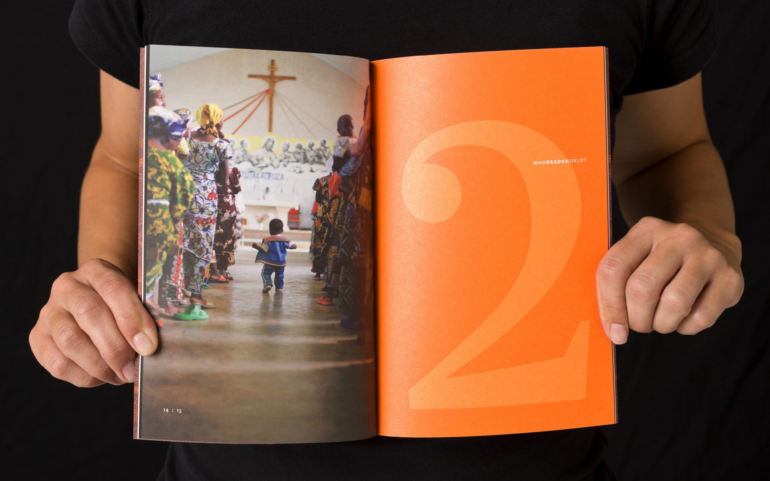
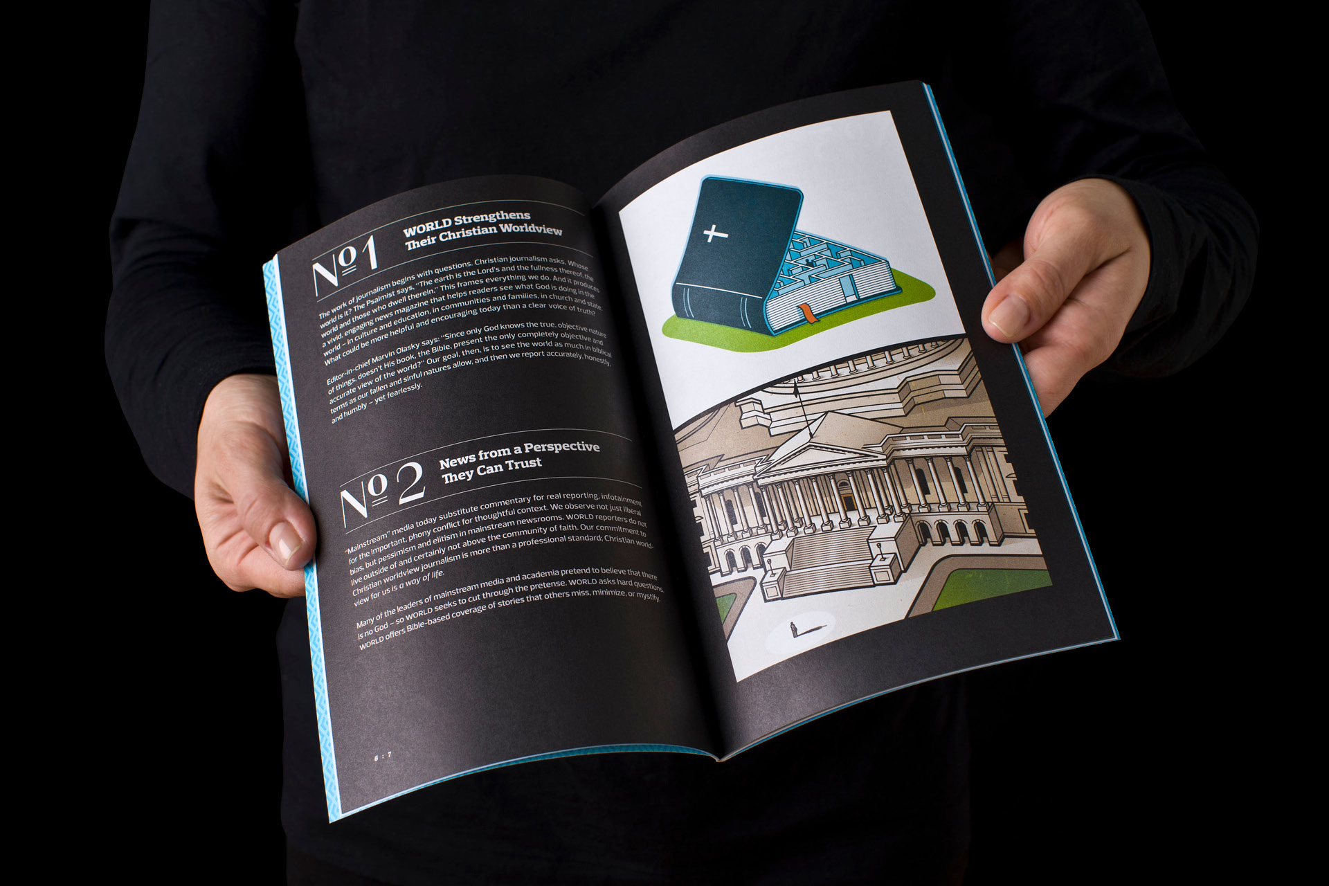
News photos and illustrations come in all shapes and sizes, and excerpts needed to be readable no matter what. We used a premium silver ink that leaps off the page and ensures legibility against any background. Throughout, we paired images across spreads for pleasant juxtaposition or provocative contrast.
The result is both intimate and inspiring. This book proved helpful as key donors read it and gave substantial support. Over several years, the dream became a reality. Today, World News Group is driven by a dynamic web-based platform, allowing them to publish a steady stream of news while developing longer narratives and commentary in the biweekly magazine.
The Quiet Sell
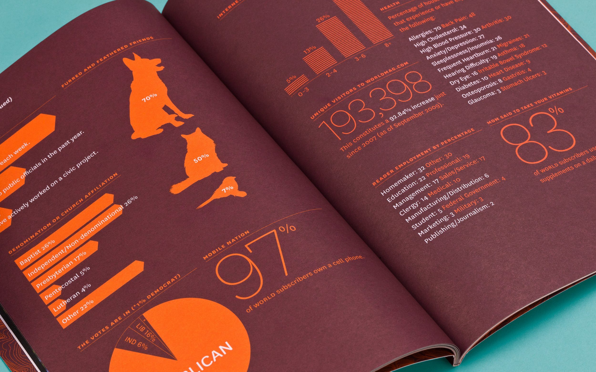
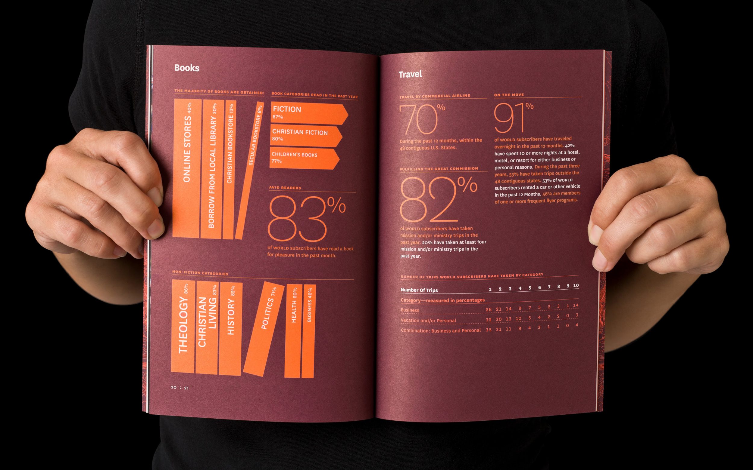
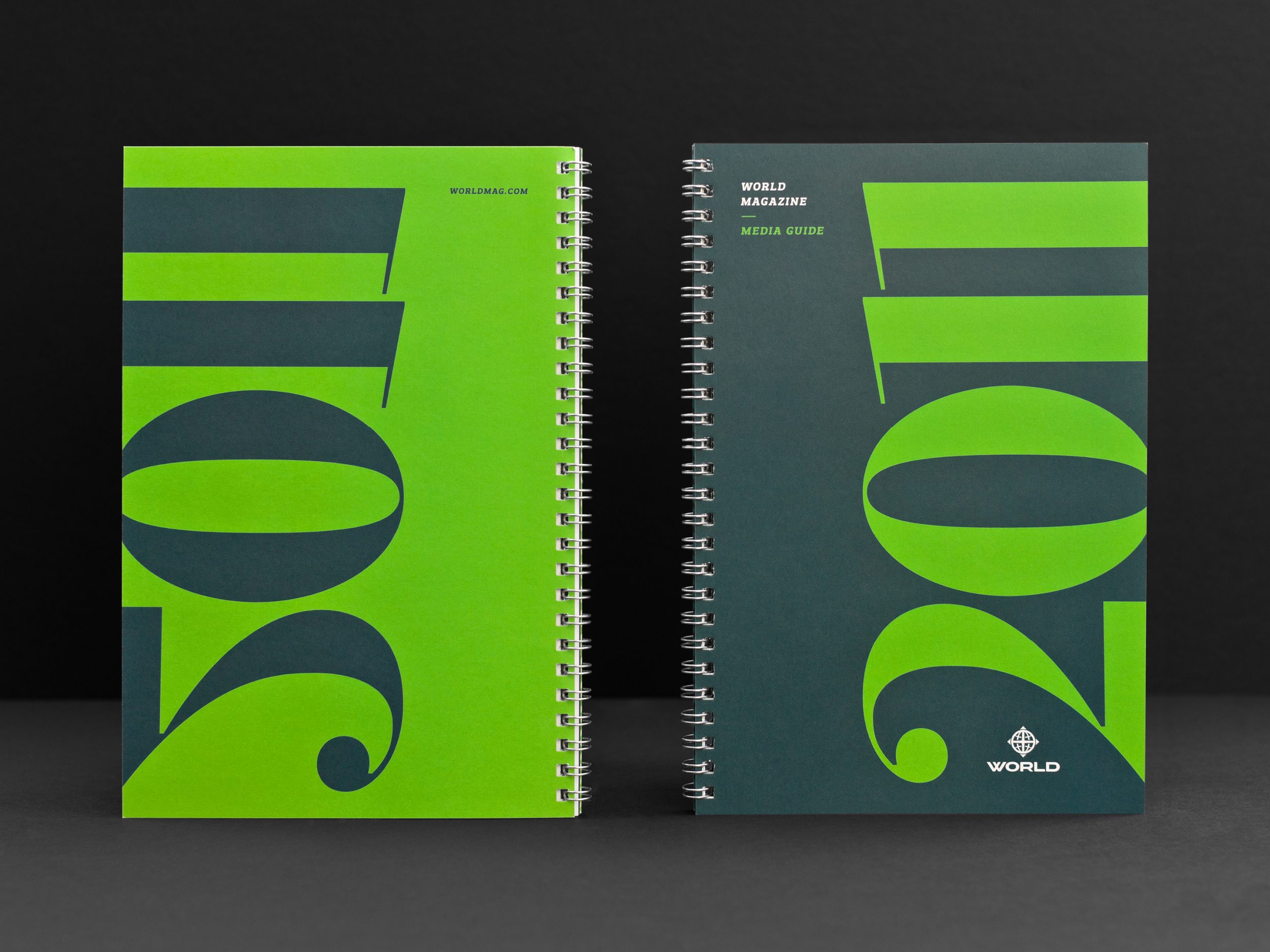
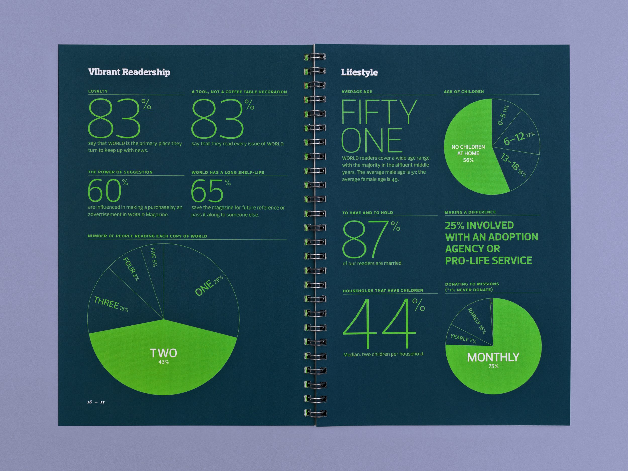
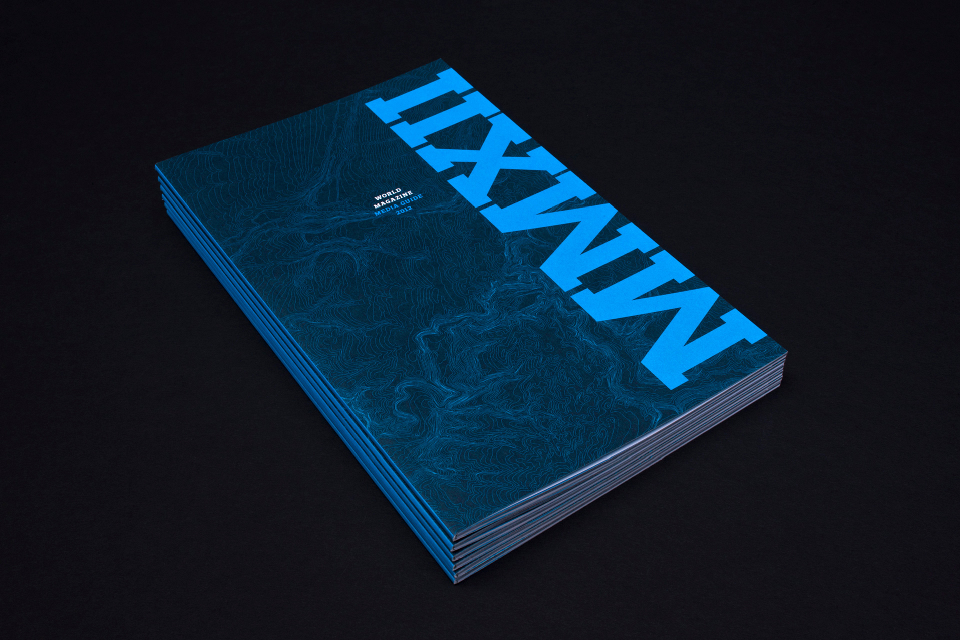
We conceived and designed a new annual media guide that acts like a quiet salesperson, a keepsake that starts with WNG’s purpose and vision. The guide begins with an adaptation of Nick Eicher’s opening essay from the Blue Book. Editorial highlights from the past year come next, followed by several spreads of rich infographics. The brochure closes with the brass tacks of World’s publishing calendar, ad specs and rates.
Advertisers loved the new approach. We ran with it for the next two years, marking each edition with distinct accent colors. After the 2010 edition, we collaborated with World’s design and editorial teams on a full rebrand. That work included new typographic and color palettes, among other changes. In 2011–12, we simply revised the media guide’s format to jell with the magazine’s new look.
Finally, I found someone who could read my mind. What I mean is Matt took my rambling, incoherent thoughts and turned them into an excellent concept, then executed perfectly.”
Nick Eicher, Chief Content Officer
